
Making TOCus a reality

Today I’m officially releasing TOCus!
TOCus is a free browser extension that adds a short pause before you visit the websites you choose.
Download the extension for Chrome, Edge, and Firefox.
I’ll post behind-the-scenes updates for this project from time to time. It’s more of a diary than a changelog. I’ll talk about the thought process, the technology, the opinions that changed, and things like that.
Hopefully it’s also useful if you want to build something similar.
Why I built TOCus
A lot of people, myself included, spend a lot of time on the computer, sometimes more than 12 hours per day. That, plus the fact that the internet is full of great, distracting things, makes it almost impossible not to get distracted.
I also hope it can help people with OCD, ADHD, or both manage distracting browsing habits. That’s why I created TOCus, to help people concentrate.
A lot of what it does comes from good and useful features I’ve seen over the years. I love trying new things that don’t exist yet, but I also love what companies like Apple do. They take an idea that has been around for some years, like folding phones, and study it and perfect it until it looks beautiful and just works. That’s what I’m trying to do with TOCus.
Pauses and statistics
I don’t like blocking sites completely. I’d rather discourage people from using them.
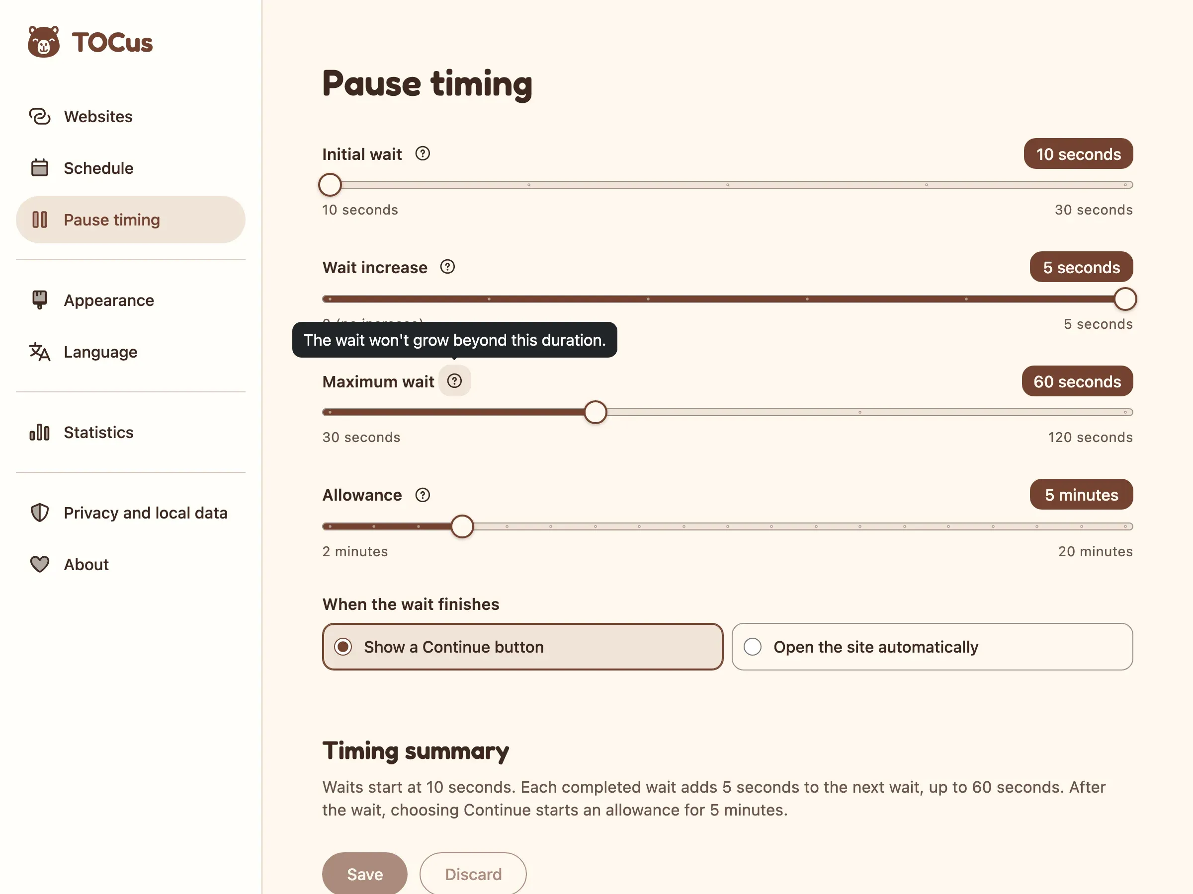
By default, users only have to breathe (or just wait) for 10 seconds, and then click Continue to get 5 minutes to browse the websites they choose. If they keep coming back, every pause they finish adds 5 seconds to the next one, up to a minute. The next day, it starts over at 10. That’s it.
All this can be changed, of course. Those are just the defaults.
In the settings, the user can:
- Change the first pause to anything from 10 to 30 seconds.
- Lower the increase from 5 seconds down to 0 to turn it off.
- Adjust the maximum pause length to between 30 seconds and 2 minutes.
- Give themselves anywhere from 2 to 20 minutes of browsing.
The statistics are there to encourage the user and show them that their effort is paying off. For example, they can see an estimate of how much time they’ve saved by closing a tab instead of waiting.
Since installing TOCus, I’ve found myself visiting sites like Reddit way less.
User experience
As always, I tried to add as little content as possible, because the less, the better. The user shouldn’t need a knowledge base article to use TOCus. In fact, they shouldn’t need a knowledge base for almost anything.
Nielsen Norman Group estimated that people read about 20% of the words on an average web page. I don’t think a browser extension is any different.
That’s why the breathing screen contains between 4 and 9 words at a time. It shows the logo, a small countdown in the top right corner, a short cue like “Breathe in”/“Breathe out”, and after you’ve saved a specific amount of time, it shows the estimated time saved at the bottom, e.g. “About 16 hr, 54 min saved”.

I reveal the information contextually, right where the user might have a question, always using simple vocabulary.
For example, on the pause timing settings page, each slider has a small question mark with one sentence, like “The wait won’t grow beyond this duration”.
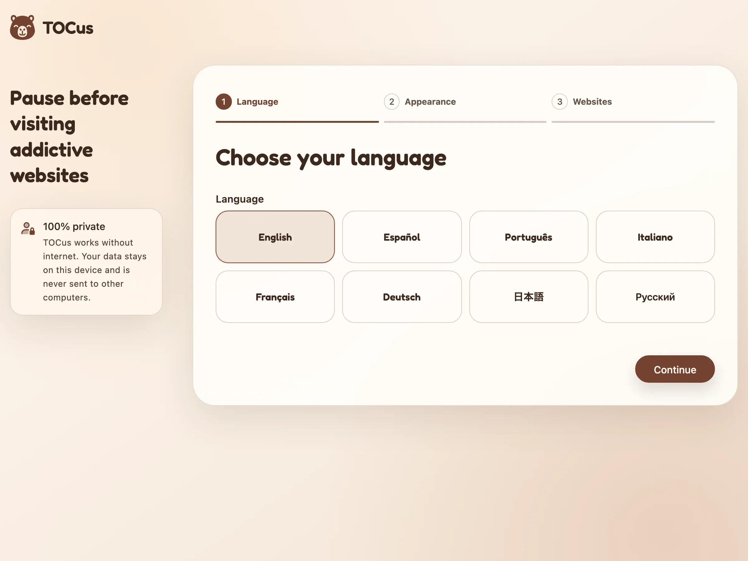
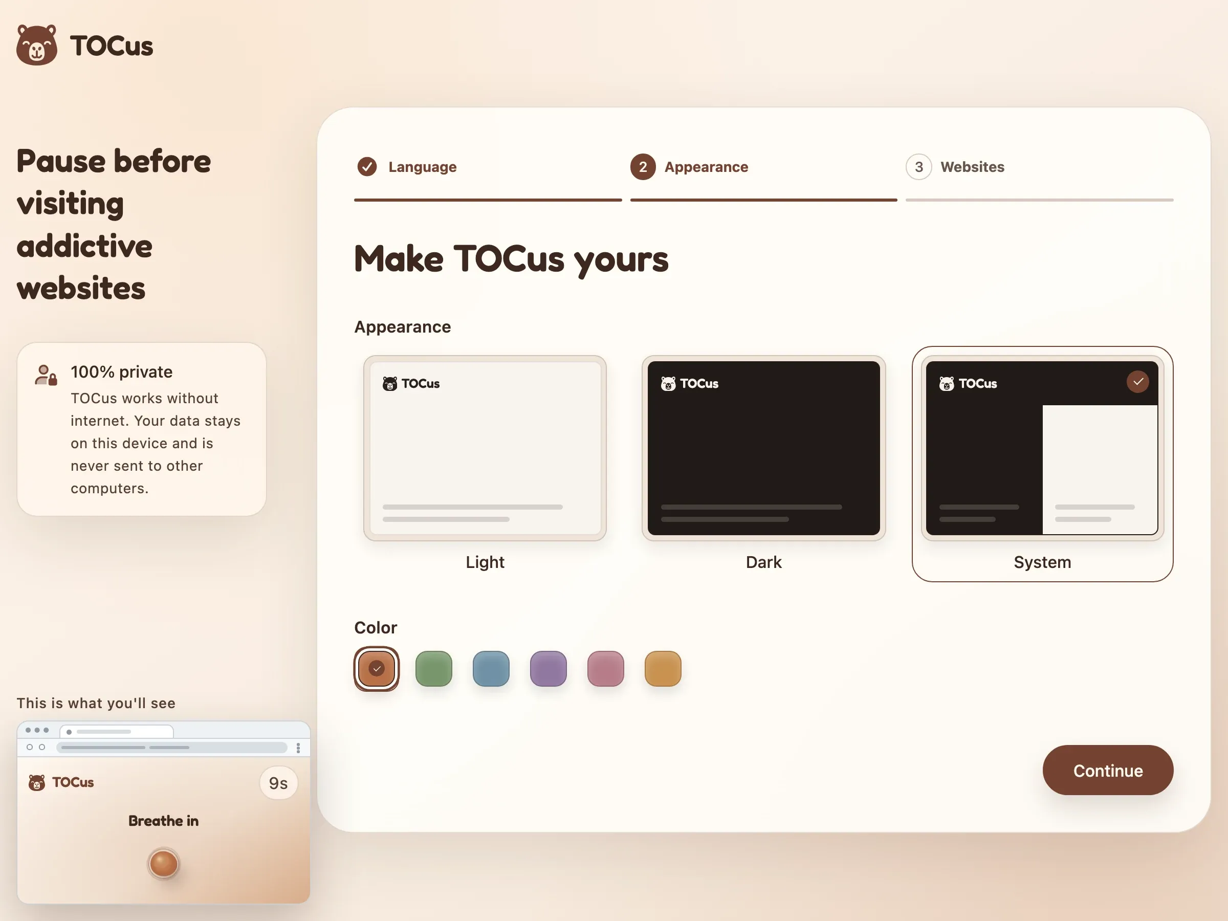
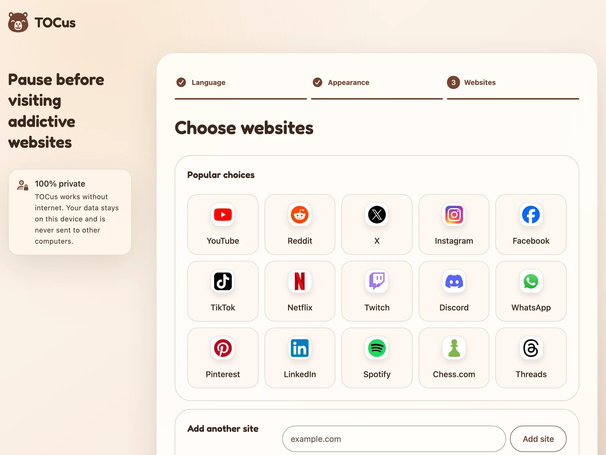
The initial setup is short.
You pick a language and a look (you can choose a color and whether to use light or dark mode), then add the websites you want to pause, and that’s it. It doesn’t ask about pause times or schedules.
I’d rather pick good ones for you than make you decide before you’ve even tried it, since people rarely change their default settings anyway.
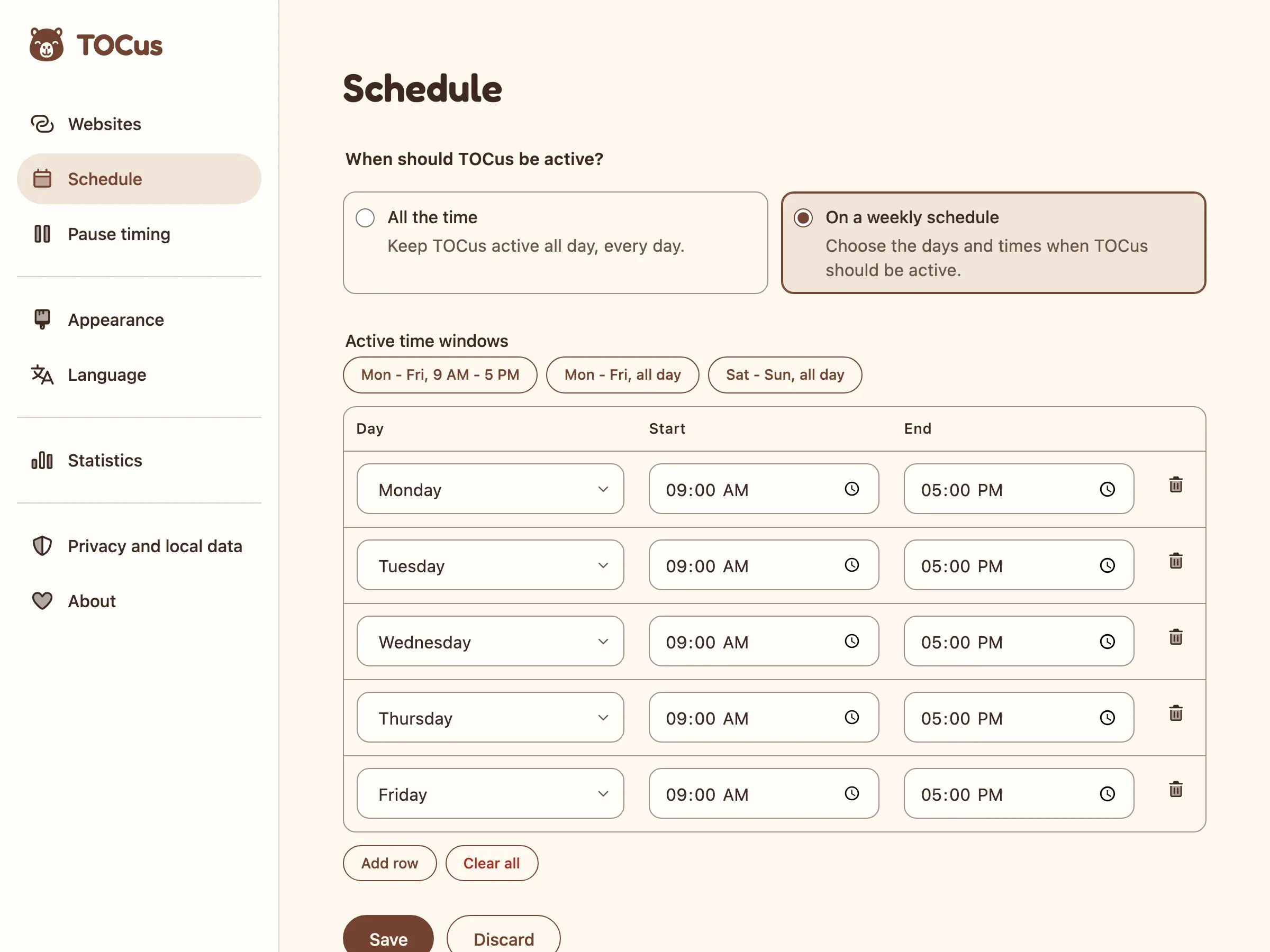
TOCus is on “All the time” by default. You only see the schedule table if you choose “On a weekly schedule” or turn on “Use custom schedule” for a site.
I didn’t want that table visible all the time for people who might never need it, because in Baymard’s checkout tests, even optional fields made some people take 5-30% longer to complete checkout steps.
If you do need a schedule, the buttons above the table fill it in with one click, for “Mon - Fri, 9 AM - 5 PM”, “Mon - Fri, all day”, or “Sat - Sun, all day”. I think this approach balances simplicity and flexibility. I didn’t find any study that would justify choosing those specific schedules, but they seem to be the most common and practical ones for most users. You can still change any row before you save, though.
Presets like these work the same way as the “Tomorrow” and “Next Week” buttons in a reminder app, which Nielsen Norman Group uses as an example of presets that keep people from typing the wrong date or time.
Name and mascot
I think this extension will be especially useful for people with compulsive behaviors or OCD (Obsessive-Compulsive Disorder). I want people to be able to focus.
My native language is Spanish. In Spanish, OCD is called TOC. Then, if you add “us” (as a community) to TOC, it sounds like “focus”.
And that’s how I came up with TOCus. TOCus is OCD, a sense of community, and focus.
I chose the capybara because it’s the chillest animal ever, and because there are a lot of them in the country where I was born, Argentina.
I don’t know yet if the mascot is also called TOCus, or if TOCus is just the extension and the mascot gets its own name. I’d like to reuse it. I guess that means it needs a different name. I’ll think about it.
Mascot creation
Just like I do for my site, I used claymorphism for the mascot. You could say it’s my brand style. I just think it’s super cool.
The colors come from the capybara itself and from the places where capybaras usually live.
For the font, I went with Fredoka (a rounded font), because it’s friendly and it works well with claymorphism.
I drew the first sketches in pencil on August 20 and turned them into renders with Codex’s image generation, which uses gpt-image-2.5-flare. I could have used gpt-image-2.5-sunburst, which is optimized for fidelity and precision editing, but I found the first to be good enough. Also, using Codex allows me to use my subscription usage instead of paying for the API.

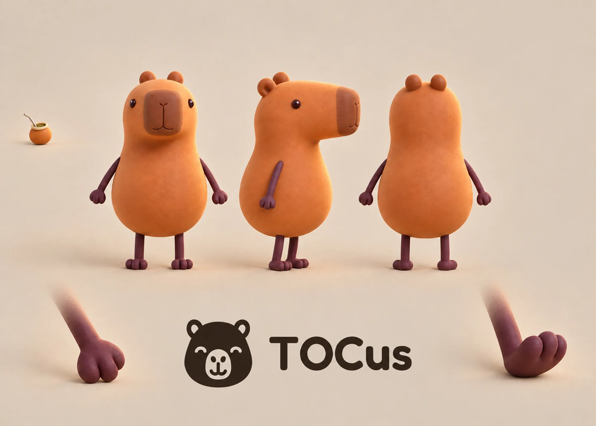
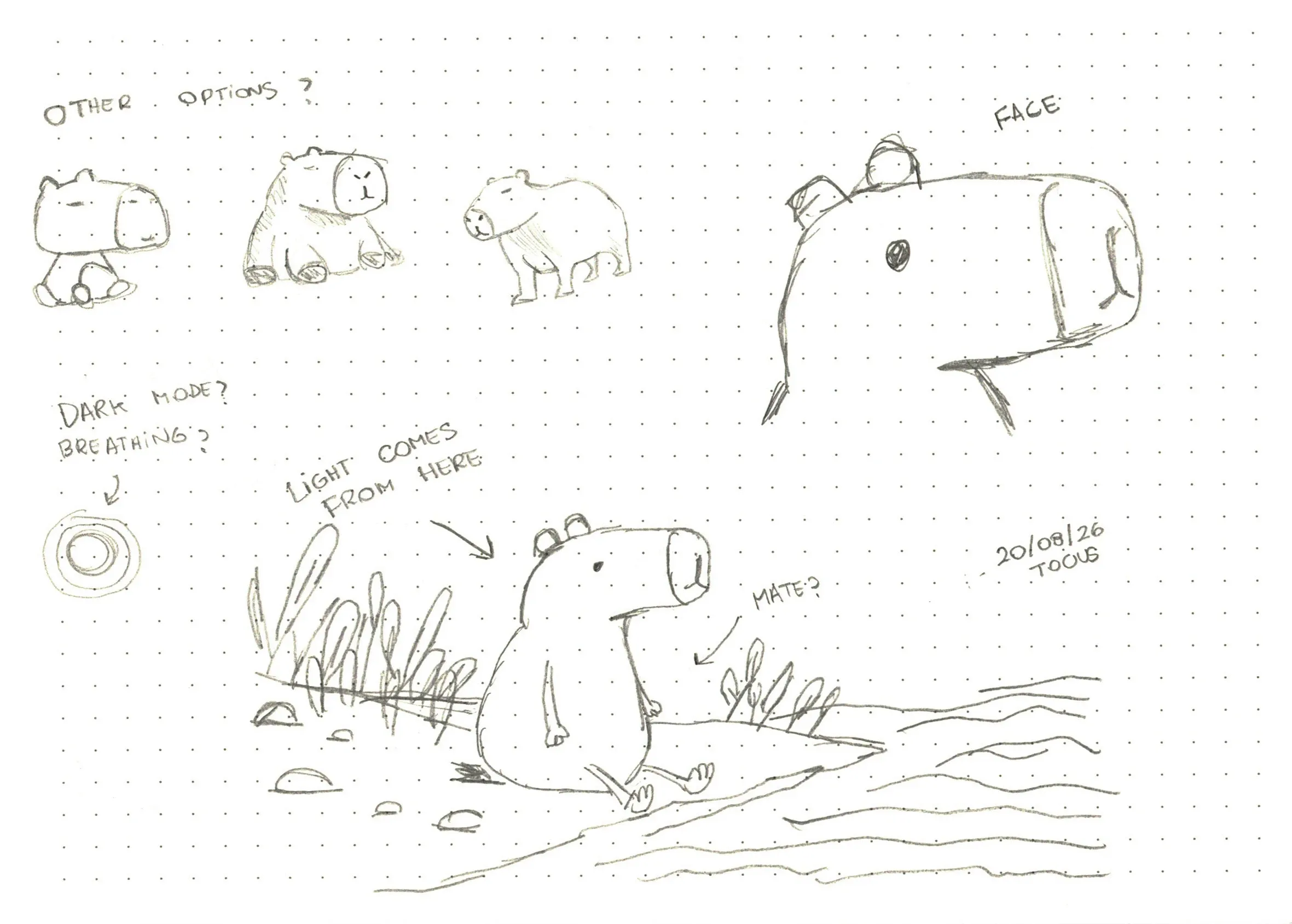

After I ended up with something I liked, I asked Codex to create a Markdown document with reference images and descriptions for all the renders so it could create more images like that while being consistent.
All the other images here came from Codex too, like the thumbnail where I’m hugging the capybara, or the 1.0.0 banner you’ll see below.
From time to time, it creates some scary images that go straight into uncanny valley territory, but most of the time it’s good. It might just need a bit of your patience.
3D models
I’m a UI/UX designer and frontend engineer, not a 3D artist, so my 3D knowledge is very limited. That said, I still wanted something different that would stand out on the website.
I figured I wanted a basic interactive 3D scene that would create a “wow” factor when users visited the site for the first time.
To start, I uploaded all the renders that I had of the capybara to Codex, selected GPT-6 Astra on Ultra, and asked it to generate a 3D scene.
It wrote Python scripts with Blender’s bpy API to build the model, the materials, the scene, and the animation.
It ran them through Blender’s command line, saved editable .blend files, and at the end exported an optimized .glb that Three.js renders on the website.
The whole thing took like five hours because it would run each script, export the results, review them and then iterate from there.

9:00 AM

12:00 PM

1:00 PM

1:30 PM
Astra made the scene I wanted, but with a ridiculous amount of triangles.
The first version had about 2.7 million: 2.1 million in the plants (1.7 million just in the reeds in the back) and about 457K in the capybara.
So I ended up using a free plant pack, the Stylized Low Poly Plants Pack 02 by Creative Trio, which brought the plants down to about 151K and the whole scene to about 731K, just by changing the plants.
I liked the look of the previous one better, but I couldn’t just upload a 2.7 million-triangle scene to the website.


I know it’s not perfect, and I know it doesn’t look exactly like the renders, but for the purposes of the website, it’s good enough. It was either that or nothing. When working on personal projects, sometimes it’s just not possible to spend days and days improving a nice-to-have.
Then I asked Astra to optimize the capybara. It went from about 457K triangles to about 36K while still looking kind of the same. That left the scene at about 312K, around half of it plants.
After that, I cut the scene down to an island. Astra kept only the plants around the capybara (about 33K triangles), trimmed the ground to that patch, and removed the pebbles outside it.
I limited the camera to 50 degrees on each side, and from there it looks like a riverbank on the mainland, but it’s really an island with nothing behind it.
I also ended up asking Astra to remove the 66K triangles needed to render the water, and I used a shader (a small script that creates visual effects) to animate and color it in real time.
The end result was a model with only 96K triangles, down from the original 2.7 million. Not bad, eh?
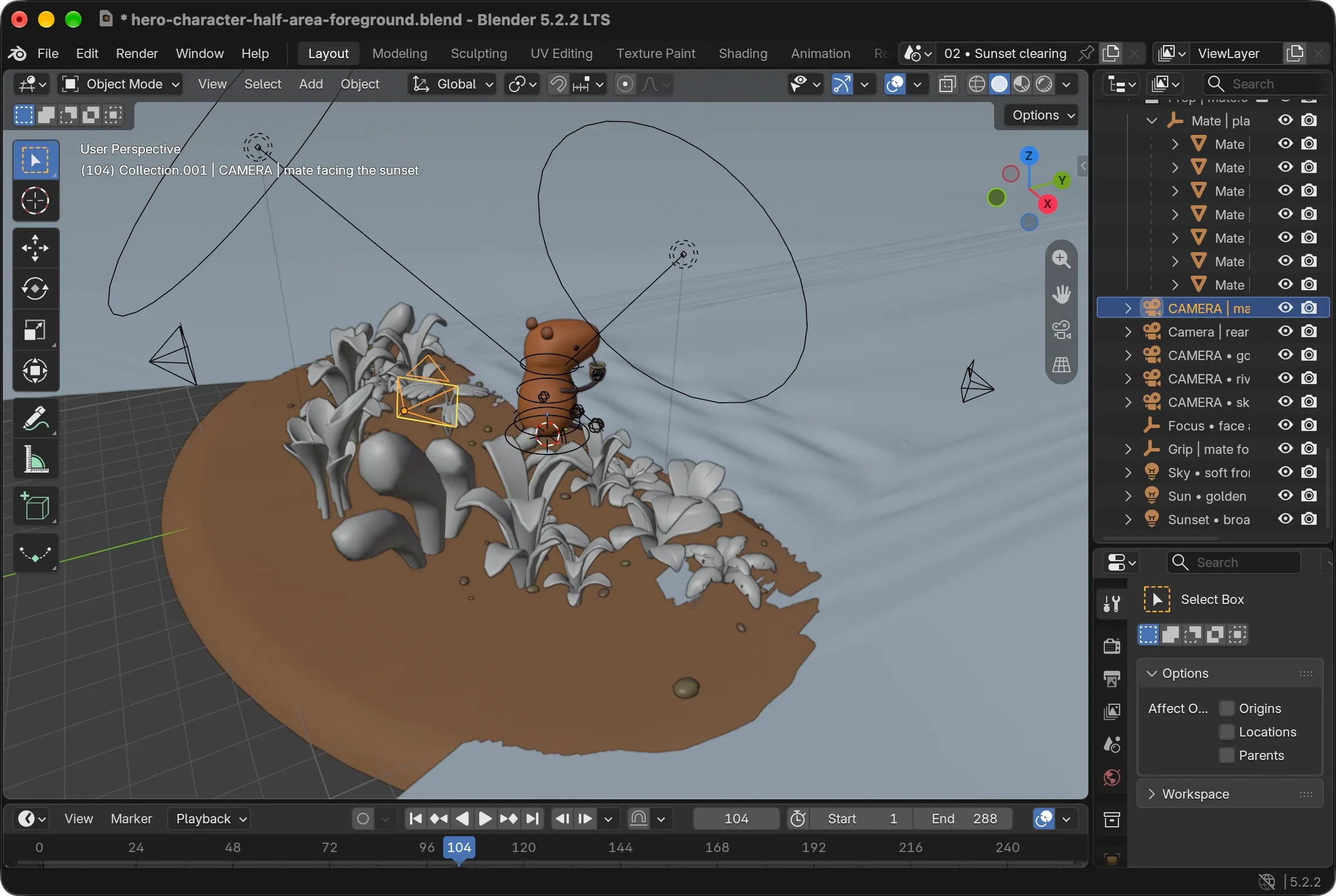
Down to 96K from 2.7 million is incredible, but there is still a lot of room for improvement. About 33K of those are the plants from the pack, and everything else is from the models Astra created.
The capybara alone has about 36K triangles, more than all the plants together, with 17K in its body. The pebbles have about 15K and the mate about 9K.
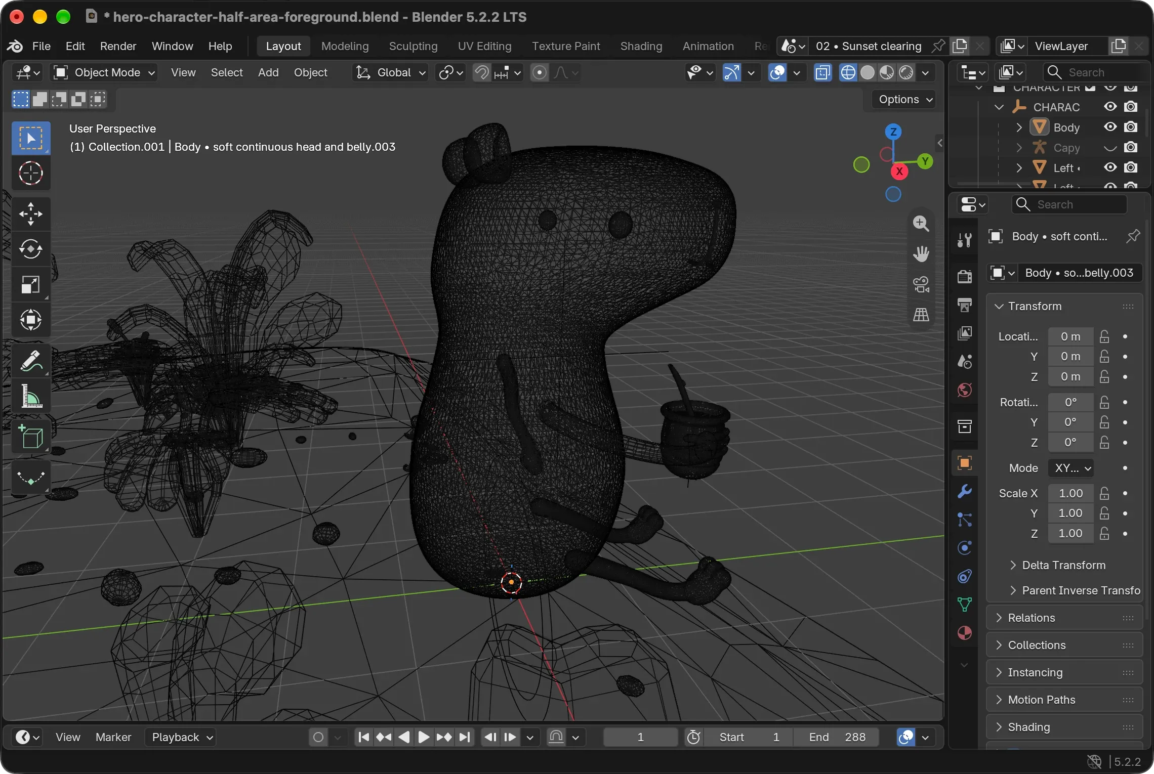
You can see in the wireframe below that Astra’s models are still very poorly optimized. The edge flow is a mess.
Instead of clean, evenly spaced quads that follow the shape of the character, it’s full of jagged, intersecting lines and irregular polygons. The density is all over the place too, with huge clusters of vertices around the ears, the eyes, and under the neck, and long, stretched edges everywhere else.
See how dense the capybara and pebbles are compared to the plants. And this is after the optimization. Imagine how it was before.
I’ll improve it in the future.
That said, if you’re a 3D artist and you want to help, please submit a PR on the repository.
Translations
TOCus is available in eight languages, with two of them having two variants each: English, German, Spanish (tú), Spanish (vos), French, Italian, Portuguese (Brazil), Portuguese (Portugal), Russian, and Japanese. I chose them based on popularity.
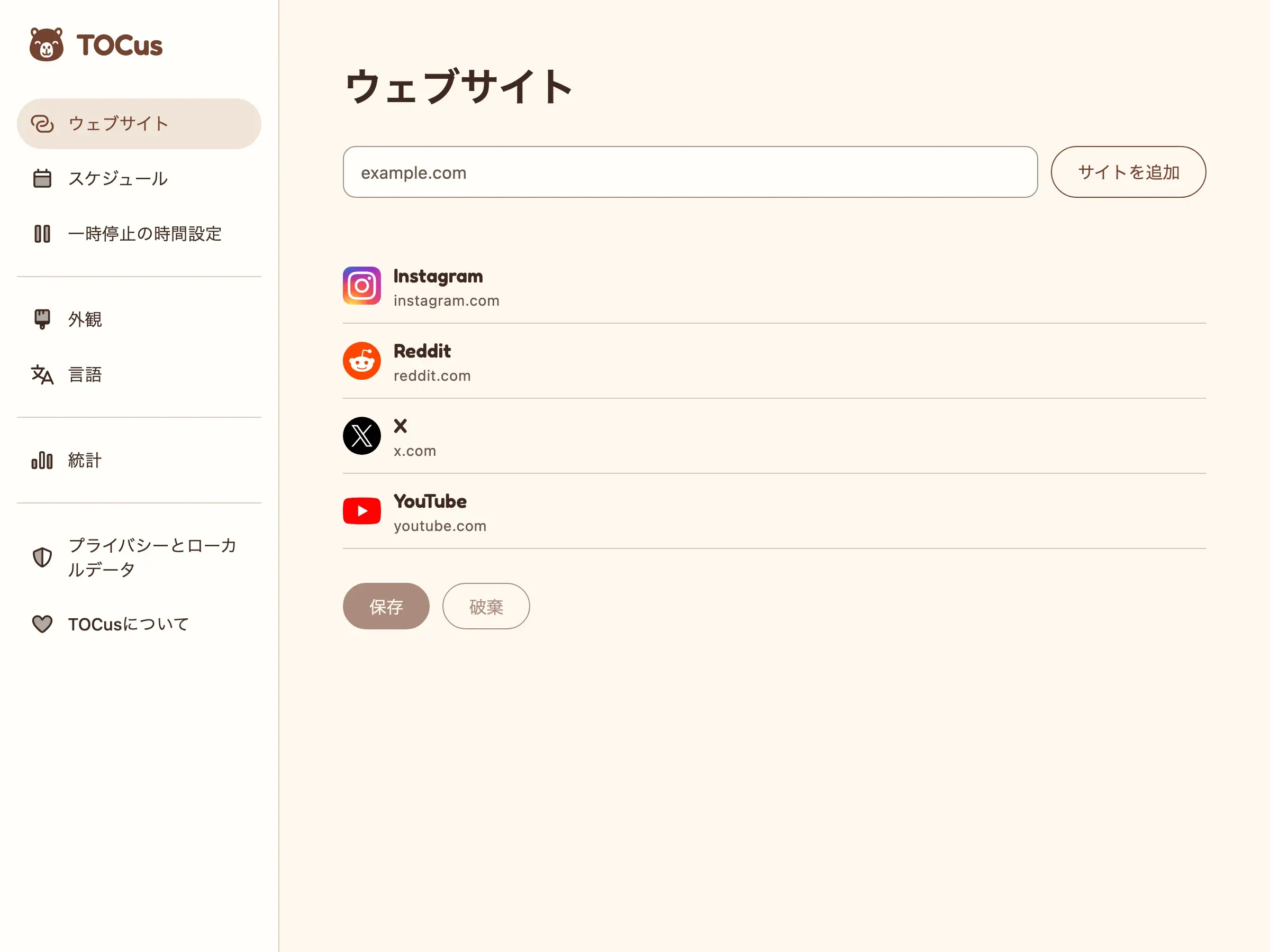
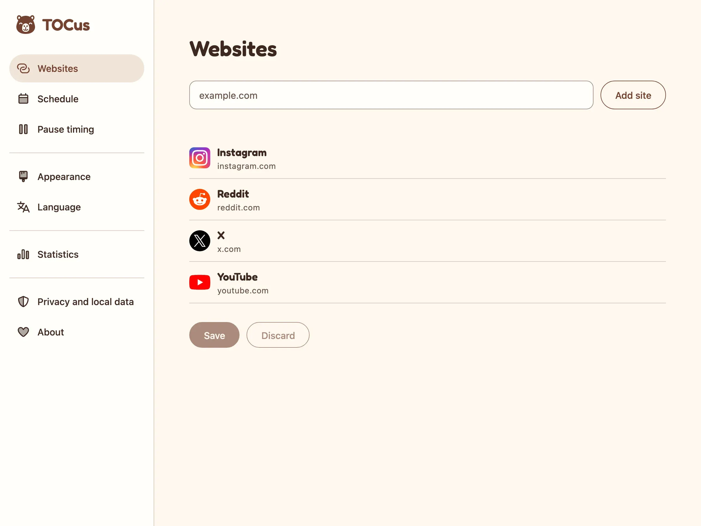
Two important things here:
First, I’m not using flags, because flags are not languages. People in Switzerland or Austria shouldn’t have to click the German flag to select the language they speak. A language is part of the identity of the user and, in that context, the German flag isn’t.
Second, whenever possible, I don’t use countries either. I mean, there are regions inside countries where completely different variations of the same language exist. I’m not talking about accents but about actual changes in the conjugation of verbs.
Spanish, for example, has two common forms of address: tú and vos. Both mean “you”, but the verbs change depending on which one you use. Vos is the default in Argentina, Uruguay and Paraguay, but it’s also used in other places, like some regions of Colombia, Bolivia, Chile and a bunch of other countries, even though the default in those would be the tú form.
Anyway, the easiest solution was to offer two Spanish options, tú and vos.
No flags, no countries. Everyone is included.
I still try to predict which one you want to see, though. If your browser is set to Spanish from Argentina or Uruguay, you get the vos form automatically.
The only limitation is that Chrome and Edge stores only have generic Spanish and Latin American Spanish, which is why the Latin American listing uses vos and the generic one uses tú.
I haven’t seen Spanish split like this instead of by country (Spain, Mexico, Argentina…) anywhere else.
I should still add Chinese. I didn’t, because the Chrome Web Store isn’t available in mainland China.
Anyway, I only speak English and Spanish, so for everything else I used Claude Fable 5.1. The challenge was, of course, to know whether the translations it was giving me made sense.
To confirm, I left small traps in the languages I already knew and I asked another AI, OpenAI’s Astra, to review the translations.
I’d ask Fable to translate everything, and then I’d replace a few Spanish strings with translations so literal they made no sense, like “una pausa silenciosa” (“a silent pause”) for “a quiet pause”. Then I would see if Astra would catch those errors and flag them to Fable. That’s how I would trust them.
Well, Astra found them, plus problems in several other languages, which I’d then have Fable fix. I did this a few times.
I think the result is pretty good, but the process isn’t perfect, so if you see a weird translation, please send me a bug report.
Store images
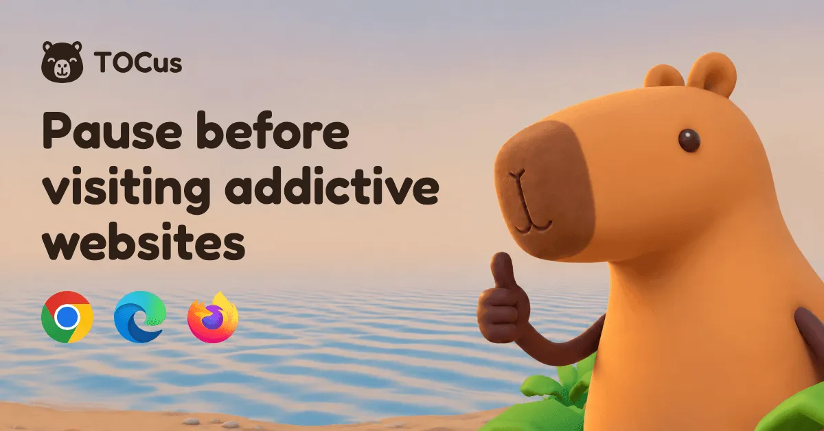
Adding so many languages also meant making images for all of them, 8 for each of the 10 language variants plus 5 English-only ones for Firefox, 85 in total.
And it wasn’t just a one-time thing. Most of them include screenshots from the actual extension, which means that every time I change something in the interface, I have to redo the screenshots as well.
So, yeah, I created a generator.
The generator renders the real interface, takes the screenshots, puts them on the final image with one of the capybara poses and the translated text, and exports everything ready for me to upload to Chrome, Edge and Firefox.
| Image | Size | #/variant | Where it goes |
|---|---|---|---|
| Open Graph image | 1200x628 | 1 | The link preview for the TOCus website in that language |
| Screenshots | 1280x800 | 5 | The Chrome Web Store and Microsoft Edge Add-ons listings. Firefox doesn’t let you upload screenshots for each language. |
| Small promo tile | 440x280 | 1 | The Microsoft Edge Add-ons listing. Chrome only uses the English version. |
| Large promo tile | 1400x560 | 1 | The Microsoft Edge Add-ons listing. Chrome only uses the English version. |
Plus some English-only exceptions.
| Image | Size | # | Where it goes |
|---|---|---|---|
| Firefox screenshots | 2400x1800 | 5 | The Firefox Add-ons listing, which uses the same screenshots for every language |
The headlines use Fredoka, but Fredoka has no Japanese or Cyrillic letters. For those, I used Chiron GoRound TC (Japanese) and Nunito (Russian).
English

Spanish (tú)

Spanish (vos)

Japanese
Publishing
TOCus is available for Chrome, Edge, and Firefox.
I didn’t publish it on Safari because of the cost. You need the Apple Developer Program, which is $99 a year.
TOCus is open source, I won’t make any money from it, and I don’t have anything else to publish on the App Store yet. Sorry, Safari users.
| Store | Cost | Desktop share |
|---|---|---|
| Chrome Web Store | $5, once | 73.28% |
| Microsoft Edge Add-ons | Free | 10.46% |
| Firefox Add-ons | Free | 5.31% |
| Safari, through the Apple Developer Program | $99 a year | 5.24% |
Safari’s 5.24% is significant, but together the other three have 89.05%. If TOCus gets popular, or if I make an iOS app that I want to publish, I’ll pay for the license and put it there too.
The day I sent it for review, September 24, I uploaded the 1.0.0 zips to GitHub. The official launch is today, September 29.

Extensions go through a review process that can take several days before they are published in the stores. Chrome was the fastest. They approved it in one day. But every change you make, even one word in the listing, goes through the same review again, which can take a few days even if the code didn’t change.
Firefox and Edge were slower. Firefox approved it after 3 days, and Edge after 5.
Open source
I made TOCus open source mostly because of privacy. A lot of people worry that extensions might be checking their full browsing history or collecting data in general. With the code open, you can download it from the repo, ask an AI to check it, and even build the package yourself with the instructions I added there. You don’t have to take my word for it.
I also just want to improve the concentration and health of the people using it. By making it open source, companies can fork it with their own branding and install it on their internal computers. If you’re a company doing this, just mention the original source, please.
Technology
TOCus is a TypeScript monorepo.
| Technology | What it does in TOCus |
|---|---|
| TypeScript | Adds types to all the code to catch mistakes during development |
| React | Builds the extension’s screens and the website’s interactive parts |
| WXT with Vite | Runs, builds, and packages the extension for each browser |
| Mantine with SCSS | Gives the interface its controls, styles, themes, and accessibility basics |
| Recharts and Mantine Charts | Draw the statistics charts |
| Astro | Generates the website as static pages |
| Three.js | Renders the animated 3D scene on the website |
| Lingui | Handles the translations for the extension and the website |
| Zod | Checks stored data and messages while the extension runs |
| pnpm with Turborepo | Manage the workspace, the dependencies, and the build tasks |
The website and the extension are the same product and share components and branding, which is why a monorepo made sense.
| Folder | What’s in it |
|---|---|
apps/extension | The browser extension |
apps/website | The TOCus website |
packages/ui | The React components the extension and the website share |
packages/theme | The colors, typography, icons, and brand assets |
tools/store-assets | The generator for the store images and the Open Graph images |
This allows me, for example, to change a shared component or style in one place and have it reflected in both the extension and the website.
pnpm links the local packages, and Turborepo runs the builds and caches them. It’s more tooling than two separate projects, but otherwise the extension and the website would each need their own copy of the shared code.
For the extension itself, I used WXT so I could have a single codebase that builds a separate package for each browser. It also helps that Chrome, Edge, and Firefox share a lot of the same extension APIs.
TOCus uses them through import { browser } from 'wxt/browser', and WXT hands it whichever one the browser has, browser or chrome.
It also generates the manifest for each browser and bundles the code.
Some differences still need their own code, though, because WXT doesn’t make every API identical, but WXT saves a lot of time.
Chrome and Edge get a Manifest V3 package with a background service worker. Firefox gets Manifest V2, with a background script the browser can stop when it isn’t needed. There’s a Safari build too, but I’m not distributing it because of what I mentioned above about the cost.
WXT picks the manifest version, and wxt.config.ts fills in the details for each browser.
The protection logic (pauses and schedules) runs on events and states.
All the protected sites share one state: idle, waiting, ready to continue, or browsing. One part of the code works out what should happen from the schedules, the progress of the pause, and the browsing time the user has left.
Another part makes it happen in the browser, with navigation rules, tab operations, alarms, and injected scripts.
Then I used React for the screens. I usually advocate for Lit and web components, but using React in this project allowed me to move a bit faster, since I had more options for the libraries that were available.
Because those parts are separate, I can test the timing and the schedules without a real browser.
The browser part also deals with things like action in Manifest V3 versus browserAction in Manifest V2.
There are two ways of displaying the pause. One is when you try to go to the site from a different site or from a new tab, without any browsing time left. The other is when you are viewing a page during your allowed time (after waiting) and then you run out of time. The first one just renders the breathing screen alone.
The second, however, has to render over the content of an unknown page. I can’t redirect users to a new page because they could lose unsubmitted form data, or progress, for example, on the video they were watching.
To prevent conflicts, the second approach (showing the pause inside the website) uses Shadow DOM, which keeps the site’s own styles from breaking it.
In the background, TOCus saves its state and uses alarms to recover when the browser stops the background code and starts it again.
Everything runs locally. The settings and statistics are in the browser’s extension storage, with some temporary state in session storage. No server is involved in pausing anything.
This has pros and cons, of course. It’s 100% private, but it also means that if you uninstall the extension and install it again, you lose your statistics and chosen sites. Also, each browser keeps its own data, which means installing TOCus in Chrome and Firefox won’t sync your settings between them.
For tests, the project uses Vitest, Playwright, Web Test Runner, accessibility checks, and visual comparisons.
Even then, those tests didn’t catch two bugs in the first Firefox release. Clicking “Continue” could send users into an infinite loop, and the toolbar popup could be too narrow to use. Both are fixed in version 1.0.1.
The tests checked the shared logic and the screens, but never the extension installed in a real browser.
I fixed it and now every production build goes through the same automated checks in Chrome, Edge, and Firefox, with the extension actually installed. They grant and remove access to a website, open the popup, continue after a pause, and let the browsing time run out. Each run uses a throwaway browser profile and accepts the browser’s permission dialogs on its own, which means the checks can also run in CI.
What’s next
I’m already looking for a university to test how well TOCus works in a study. As I mentioned before, people rarely touch their defaults, so I want real numbers on them. I want to see whether the 10-second pause, the 5 minutes of browsing, and the extra 5 seconds per pause are actually the most effective setup.
I didn’t have time to improve and optimize the 3D models on the website any further. If I get them right once, I could use them for a lot more, maybe even a small mobile game.
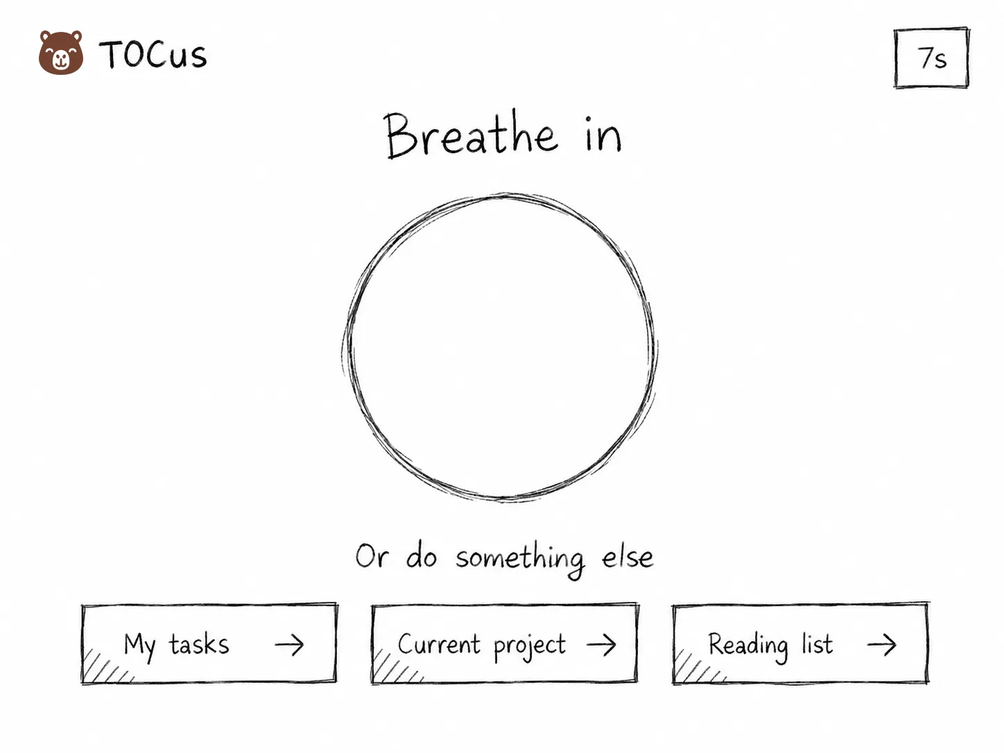
On the pause screen, I’d like to add up to three links to better things to do, like getting back to your project management site to see your tasks. You’d choose them.
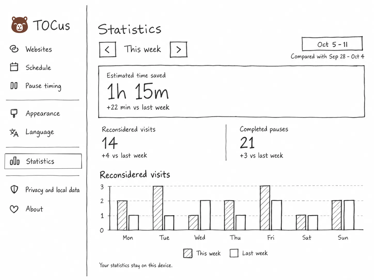
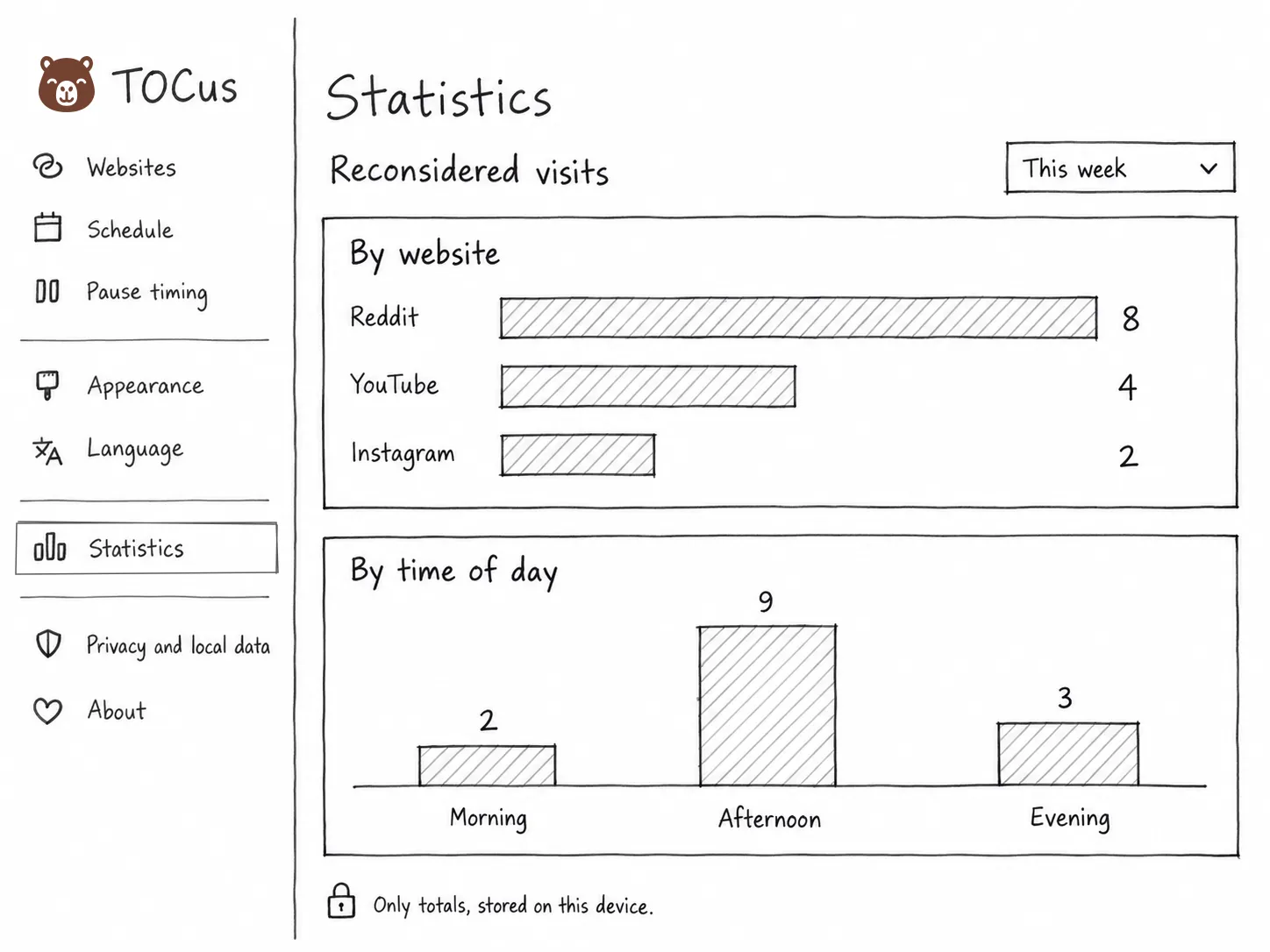
The statistics could also be more useful while keeping all the data on the device, with weekly trends, the sites you reconsider the most, a comparison with last week, or the time of day you reconsider most.
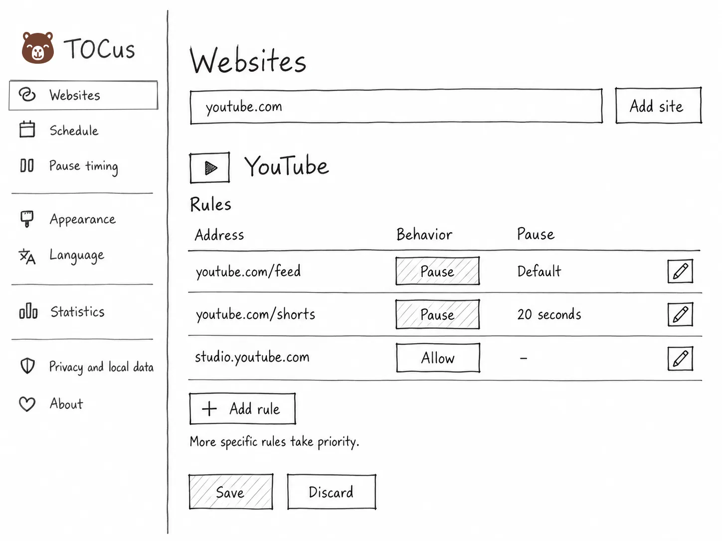
Right now TOCus pauses a whole site, but I’d like to add rules for paths (like youtube.com/shorts) and subdomains (like studio.youtube.com).
| Address | What TOCus would do |
|---|---|
youtube.com/feed | Pause it |
youtube.com/shorts | Pause it for longer, like 20 seconds |
studio.youtube.com | Let it through |
The same would work for Reddit, X, Instagram, or Facebook. It would make TOCus a lot more useful if you need the productive parts of a site that’s otherwise distracting.
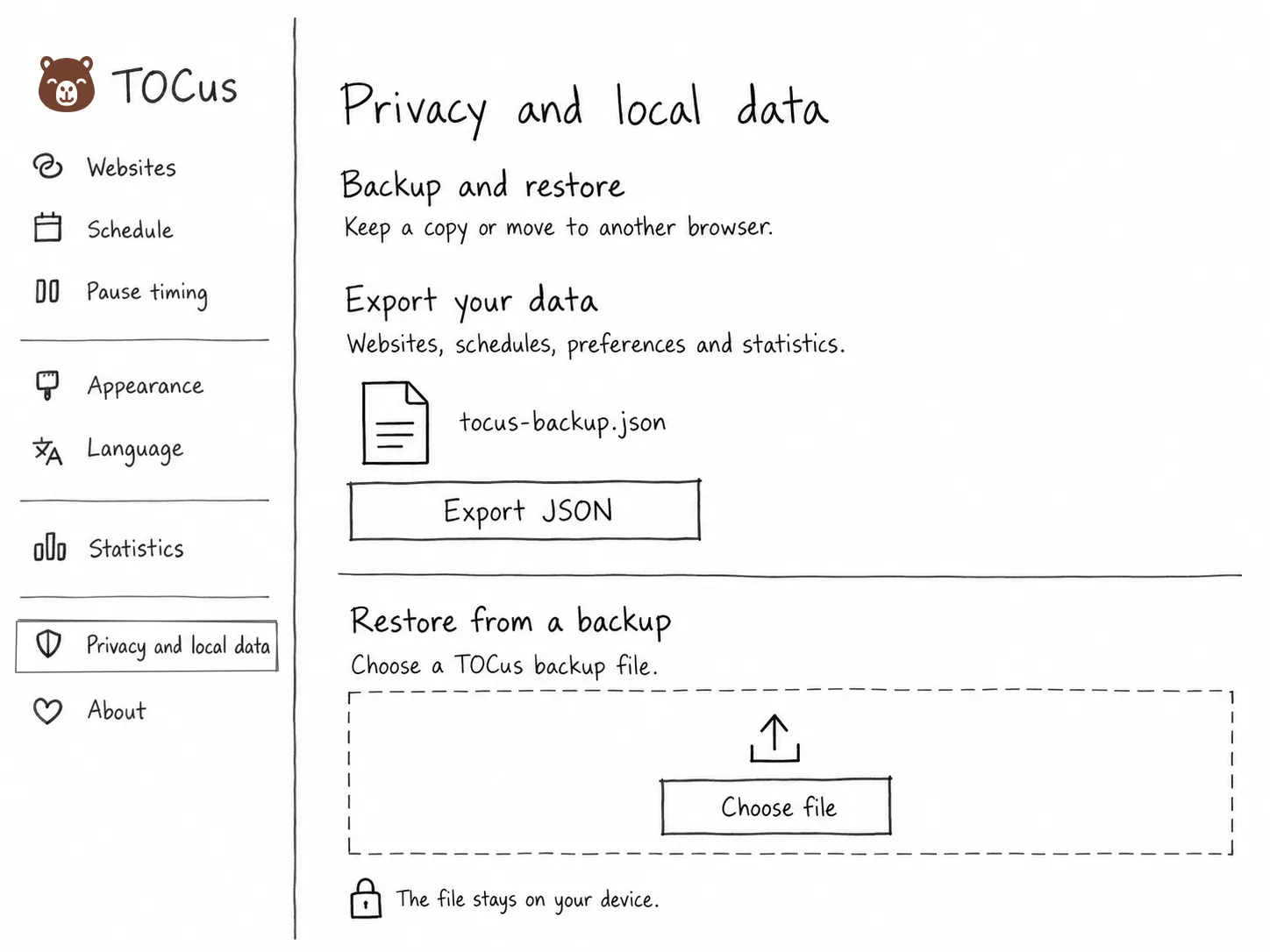
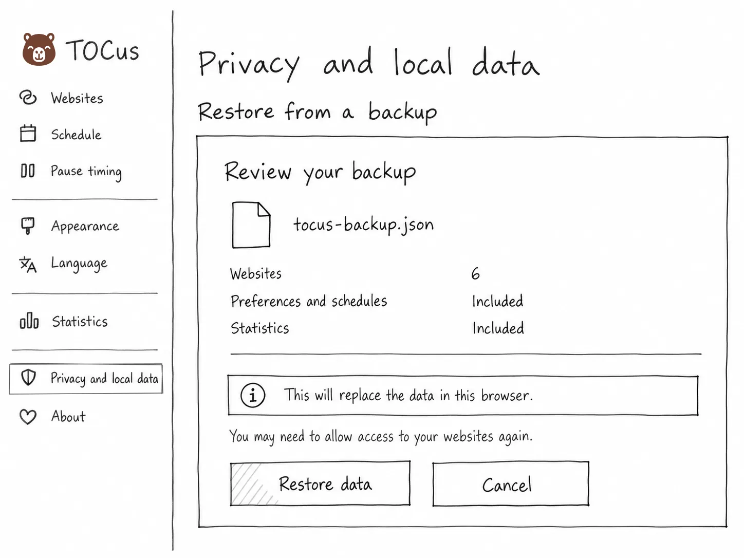
TOCus data management is great for privacy but not so good for the user experience, as users lose their data if they uninstall the extension and have to start over if they switch browsers. For that reason, I’d like to add an export and import feature. Just a simple JSON import/export would be enough.
I’d also like to make promo videos and use some Google Ads credits I have, but I’m not sure how yet. I can’t spend weeks on them, and I don’t want the ads to look AI generated. I’ll probably give Higgsfield AI a try.
Do you have more ideas? Please open a feature request!