
Building an Accordion the Browser Can Search
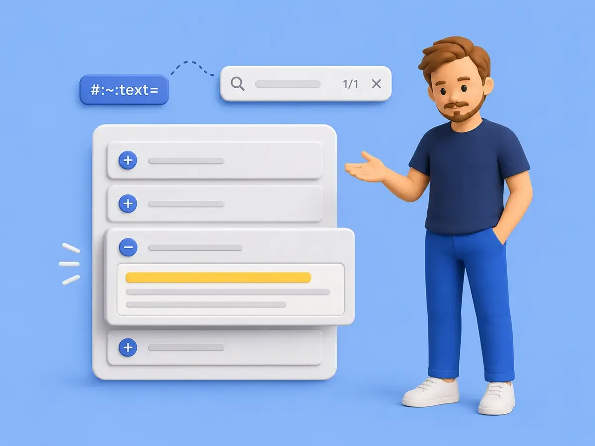
Want more of these in your Google results?
An FAQ collapses every answer with display: none. It opens and closes fine, the buttons are keyboard friendly, and it passes every test someone wrote for it. Then a user opens the page, presses Cmd/Ctrl F to find a phrase they know is in there somewhere, and the browser finds nothing. The phrase lives in a closed answer, the answer is display: none, and as far as the browser’s own find-in-page is concerned that text does not exist on the page. The component test passes and the browser test fails, in the same widget, on the same words.
That gap is the whole subject. The failing search is on screen below, then the few lines that caused it. The demo hands you a phrase, so open it in its own tab, copy the phrase, and run your own Find on it.
import { LitElement, html } from 'lit';
import { customElement, state } from 'lit/decorators.js';

/**
 * The stylesheet for the light-DOM fixture, injected as a plain `<style>` element.
 *
 * The harness renders into the light DOM so find-in-page reaches the fixture, which means there is no shadow root to scope `static styles`, so the CSS ships as a text child of a `<style>` tag instead.
 */
const STYLES = `
	.naive-demo {
		font-family: var( --font-sans, system-ui, sans-serif );
		color: var( --ink, #17171a );
		padding: 22px;
	}
	.naive-demo code {
		font-family: var( --font-mono, monospace );
	}
	.naive-demo .hint {
		margin: 0 0 14px;
		border-radius: 9px;
		border: 1px solid #f1d27a;
		background: #fdf6e3;
		padding: 10px 12px;
		font-size: 13px;
		line-height: 1.5;
		color: #8a6d1f;
	}
	.naive-demo .phrase {
		display: flex;
		gap: 8px;
		align-items: center;
		margin-top: 8px;
	}
	.naive-demo .phrase button,
	.naive-demo .open-tab {
		font: inherit;
		font-size: 12px;
		cursor: pointer;
		padding: 6px 10px;
		border-radius: 6px;
		border: 1px solid var( --line, #e7e6e2 );
		background: var( --bg, #fcfcfb );
		color: var( --ink, #17171a );
	}
	.naive-demo .open-tab {
		margin-bottom: 16px;
	}
	.naive-demo .item {
		border: 1px solid var( --line, #e7e6e2 );
		border-radius: 10px;
		margin-bottom: 10px;
		background: var( --surface, #fff );
		overflow: hidden;
	}
	.naive-demo .item > button {
		width: 100%;
		text-align: left;
		font: inherit;
		font-weight: 600;
		cursor: pointer;
		padding: 13px 15px;
		border: 0;
		background: transparent;
		color: var( --ink, #17171a );
	}
	.naive-demo .answer {
		padding: 0 15px 13px;
		font-size: 14.5px;
		line-height: 1.6;
		color: var( --ink-soft, #56565c );
	}
	.naive-demo .answer[hidden] {
		display: none;
	}
	.naive-demo .result {
		margin-top: 6px;
		font-size: 12.5px;
		line-height: 1.5;
		color: var( --ink-faint, #71717b );
	}
`;

/**
 * Demo harness for the naive `display: none` FAQ that fails a find-in-page search.
 *
 * It renders the FAQ into the light DOM so the reader's own find-in-page can reach it, and it hides each collapsed answer with `display: none`, which the browser's Find cannot reveal.
 * The search phrase lives only inside a collapsed answer, and it is never rendered into any visible element, so the reader copies it from a copy-only button rather than reading it off the page, and a search can only ever succeed by matching the collapsed answer itself.
 * The find test runs in the demo's own tab, opened from the button, so the surrounding article prose and code panel can never satisfy the search in place of the collapsed content.
 *
 * @element demo-searchable-accordions-searchable-naive
 */
@customElement( 'demo-searchable-accordions-searchable-naive' )
export class SearchableNaiveDemo extends LitElement {

	/**
	 * The id of the answer currently expanded by a click, or null when all are collapsed.
	 */
	@state()
	private openId: string | null = null;

	/**
	 * The clipboard copy outcome, for the button's honest confirmation label.
	 *
	 * It reads `copied` on a successful write and `failed` when the clipboard write throws or is unavailable, so the button never claims success the reader cannot act on.
	 */
	@state()
	private copyState: 'idle' | 'copied' | 'failed' = 'idle';

	/**
	 * The phrase tucked inside a closed answer, which only a find match on that answer could surface.
	 *
	 * It is deliberately absent from the article prose, so the only place a search could match it is the collapsed answer.
	 */
	private readonly phrase = 'ozone kestrel drift';

	/**
	 * The FAQ entries, each with an answer hidden by `display: none` when collapsed.
	 */
	private readonly faqs = [
		{
			id: 'answer-refunds',
			question: 'How do refunds work?',
			answer: 'Refunds are available within 30 days. Quote the phrase ozone kestrel drift to support for a faster turnaround.',
		},
		{
			id: 'answer-plans',
			question: 'Can I change my plan?',
			answer: 'You can switch plans at any time from billing, and the new rate starts on your next cycle.',
		},
	];

	/**
	 * Renders into the light DOM so find-in-page and the reveal algorithm treat the fixture as ordinary document content.
	 *
	 * @returns This element, so Lit renders the template as light-DOM children instead of into a shadow root.
	 */
	protected createRenderRoot(): HTMLElement {
		return this;
	}

	/**
	 * Copies the search phrase so the reader can paste it into their browser's find bar.
	 *
	 * It reports the real outcome, recording `copied` only when the clipboard write resolves and `failed` when it rejects or is unavailable, because the reader must actually hold the phrase to run the find test.
	 */
	private copyPhrase = async (): Promise<void> => {
		try {
			await navigator.clipboard.writeText( this.phrase );
			this.copyState = 'copied';
		} catch {
			this.copyState = 'failed';
		}
	};

	/**
	 * Opens this same demo in its own tab, where the only searchable text is the fixture.
	 */
	private openInTab = (): void => {
		window.open( window.location.href, '_blank', 'noopener' );
	};

	/**
	 * Toggles an answer open or closed on a click, revealing `display: none` content that Find still cannot reach on its own.
	 *
	 * @param id - The answer to toggle.
	 */
	private toggle( id: string ): void {
		this.openId = this.openId === id ? null : id;
	}

	/**
	 * Renders the copy-only phrase control, the open-in-tab control, and the `display: none` FAQ.
	 */
	render() {
		return html`
			<style>${ STYLES }</style>
			<div class="naive-demo">
				<div class="hint">
					Copy the test phrase, open the demo in its own tab, press <kbd>Cmd/Ctrl F</kbd>, and paste to search.
					The browser finds nothing, because the answer is <code>display: none</code>.
					<div class="phrase">
						<button @click=${ this.copyPhrase }>${ this.copyState === 'copied' ? 'Copied' : this.copyState === 'failed' ? 'Copy failed' : 'Copy test phrase' }</button>
					</div>
				</div>

				<button class="open-tab" @click=${ this.openInTab }>Open this demo in its own tab</button>

				${ this.faqs.map(
					( faq ) => html`
						<div class="item">
							<button
								aria-expanded=${ this.openId === faq.id }
								aria-controls=${ faq.id }
								@click=${ () => this.toggle( faq.id ) }
							>
								${ faq.question }
							</button>
							<div class="answer" id=${ faq.id } ?hidden=${ this.openId !== faq.id }>${ faq.answer }</div>
						</div>
					`,
				) }

				<p class="result">
					Click a question and its answer appears, so the content is really there.
					Search for it with Find while it is closed and the browser cannot reach it.
				</p>
			</div>
		`;
	}
}

declare global {
	interface HTMLElementTagNameMap {
		'demo-searchable-accordions-searchable-naive': SearchableNaiveDemo;
	}
}A search index or a router is the wrong instinct. A collapsed answer is still part of the page, and several parts of the browser still expect to reach it. Find-in-page expects to match it, a #id deep link expects to open it, a #:~:text= link expects to land on a sentence inside it, and a screen reader expects a control that announces it. display: none quietly tells every one of those “there’s nothing here,” and the platform now gives you better ways to say “this is collapsed, but you can still find it.”
A quick note on letting AI code this
You should hand the accordion to an AI, and most days you will. Ask for one and you get a working display: none version in seconds, and it runs fine while quietly breaking find-in-page, deep links, and scroll-to-text. A model can’t infer which browser contracts matter here unless your request or the surrounding product context makes them explicit, so it optimizes for the visible behavior and ships the version that looks done. Name the contracts and it builds the better version just as readily: ask for “a findable accordion that uses <details name> where it fits and reveals collapsed content to find-in-page where it doesn’t,” and you get exactly that. Your leverage is knowing which contracts to name and how to test the result, and that eye only matters more as the models get better at producing whatever you describe.
Hidden is not one state
The trap is treating hidden as a single on/off switch. It isn’t. An element can be hidden from layout, from sight, from the accessibility tree, from the browser’s search, or only until the user goes looking, and those are different contracts with different consequences. Pick the technique by who should still reach the content, and let the rightmost columns of this table be the decision your habits defer to.
| Technique | Rendered? | Generates a box? | Find in page? | #id visual reveal? | Scroll-to-text? | In a11y tree? |
|---|---|---|---|---|---|---|
display: none | no | no | no | no | no | no |
hidden (boolean) | no | no | no | no | no | no |
content-visibility: hidden | no | yes | no | no | no | no |
content-visibility: auto | near viewport | yes | yes | yes | yes | yes |
hidden="until-found" | no until found | yes | yes | yes | yes | no until found |
| visually hidden (clip) | yes, clipped | yes | browser-dependent | stays clipped | browser-dependent | yes |
Two details that bite. The boolean hidden attribute equals display: none only because of the user agent stylesheet, so an author rule like [hidden] { display: block } cancels it. And for a #id that points into display: none content, the element is still selected as the target and :target still matches, so the precise statement is “no visual reveal,” not “the fragment can’t target it.” The link technically works, nothing just shows.
You can poke at every row of that table. This lab applies one technique at a time to the same answer and splits the readout in two, what the page can actually detect on the left, and the browser behavior you have to test with your own Find on the right.
import { LitElement, html } from 'lit';
import { customElement, state, query } from 'lit/decorators.js';

/**
 * The stylesheet for the light-DOM fixture, injected as a plain `<style>` element.
 *
 * The harness renders into the light DOM so find-in-page reaches the sample panel, which means there is no shadow root to scope `static styles`, so the CSS ships as a text child of a `<style>` tag instead.
 */
const STYLES = `
	.hidden-lab {
		font-family: var( --font-sans, system-ui, sans-serif );
		color: var( --ink, #17171a );
		padding: 22px;
	}
	.hidden-lab code {
		font-family: var( --font-mono, monospace );
	}
	.hidden-lab .hint {
		margin: 0 0 14px;
		border-radius: 9px;
		border: 1px solid #f1d27a;
		background: #fdf6e3;
		padding: 10px 12px;
		font-size: 13px;
		line-height: 1.5;
		color: #8a6d1f;
	}
	.hidden-lab .phrase {
		display: flex;
		gap: 8px;
		align-items: center;
		margin-top: 8px;
	}
	.hidden-lab .phrase button,
	.hidden-lab .open-tab {
		font: inherit;
		font-size: 12px;
		cursor: pointer;
		padding: 6px 10px;
		border-radius: 6px;
		border: 1px solid var( --line, #e7e6e2 );
		background: var( --bg, #fcfcfb );
		color: var( --ink, #17171a );
	}
	.hidden-lab .open-tab {
		margin-bottom: 16px;
	}
	.hidden-lab .switch {
		display: flex;
		flex-wrap: wrap;
		gap: 6px;
		margin-bottom: 16px;
	}
	.hidden-lab .switch button {
		font: inherit;
		font-family: var( --font-mono, monospace );
		font-size: 12px;
		cursor: pointer;
		padding: 7px 10px;
		border-radius: 7px;
		border: 1px solid var( --line, #e7e6e2 );
		background: var( --bg, #fcfcfb );
		color: var( --ink-soft, #56565c );
	}
	.hidden-lab .switch button[aria-pressed='true'] {
		border-color: var( --accent, #2257e6 );
		background: color-mix( in srgb, var( --accent, #2257e6 ) 12%, var( --surface, #fff ) );
		color: var( --ink, #17171a );
		font-weight: 600;
	}
	.hidden-lab .stage {
		border: 1px dashed var( --line, #e7e6e2 );
		border-radius: 10px;
		padding: 14px;
		margin-bottom: 16px;
		min-height: 64px;
	}
	.hidden-lab .stage > p {
		margin: 0 0 8px;
		font-size: 13px;
		color: var( --ink-faint, #71717b );
	}
	.hidden-lab .panel {
		border-radius: 8px;
		background: color-mix( in srgb, var( --accent, #2257e6 ) 8%, var( --surface, #fff ) );
		padding: 12px 14px;
		font-size: 14px;
		line-height: 1.55;
		color: var( --ink, #17171a );
	}
	.hidden-lab .cols {
		display: grid;
		grid-template-columns: 1fr 1fr;
		gap: 12px;
	}
	.hidden-lab .col {
		border: 1px solid var( --line, #e7e6e2 );
		border-radius: 10px;
		padding: 12px 14px;
	}
	.hidden-lab .col h4 {
		margin: 0 0 8px;
		font-family: var( --font-mono, monospace );
		font-size: 10.5px;
		letter-spacing: 0.06em;
		text-transform: uppercase;
		color: var( --ink-faint, #71717b );
	}
	.hidden-lab .row {
		display: flex;
		justify-content: space-between;
		gap: 10px;
		font-size: 13px;
		padding: 4px 0;
	}
	.hidden-lab .row .k {
		color: var( --ink-soft, #56565c );
	}
	.hidden-lab .row .v {
		font-family: var( --font-mono, monospace );
		font-weight: 600;
	}
	.hidden-lab .test {
		margin-top: 12px;
		font-size: 12.5px;
		line-height: 1.5;
		color: var( --ink-faint, #71717b );
	}
	.hidden-lab .test code {
		font-family: var( --font-mono, monospace );
		color: var( --ink, #17171a );
	}
	@media ( max-width: 560px ) {
		.hidden-lab .cols {
			grid-template-columns: 1fr;
		}
	}
`;

/**
 * One hiding technique the lab can apply to the sample panel.
 *
 * `id` keys the switch, `label` shows in the control, and `apply` mutates the panel to match the technique under test.
 */
interface Technique {

	/**
	 * The stable key for the technique, used by the segmented control.
	 */
	id: string;

	/**
	 * The human label shown on the control.
	 */
	label: string;

	/**
	 * Applies the technique to the sample panel, clearing whatever the last one set.
	 *
	 * @param $panel - The panel whose hiding the lab is demonstrating.
	 */
	apply: ( $panel: HTMLElement ) => void;
}

/**
 * Demo harness for the hiding-technique lab.
 *
 * It renders the sample panel into the light DOM so the reader's own find-in-page can reach it, then applies one technique at a time to that panel, from `display: none` through `hidden="until-found"`, and reports two honest columns.
 * The left column reads what page JavaScript can actually detect: the computed `display`, a box-generation approximation from `getClientRects()`, and whether `beforematch` fired since the last technique change.
 * The right column states the expected collapsed-state behavior, whether the panel is found by Find and present in the accessibility tree, which page script cannot reliably introspect and the reader confirms in the demo's own tab.
 *
 * @element demo-searchable-accordions-searchable-hidden-lab
 */
@customElement( 'demo-searchable-accordions-searchable-hidden-lab' )
export class SearchableHiddenLabDemo extends LitElement {

	/**
	 * The id of the technique currently applied to the sample panel.
	 */
	@state()
	private current = 'display-none';

	/**
	 * Whether the panel's `beforematch` has fired since the last technique change.
	 *
	 * Only `hidden="until-found"` can ever set this true, which is the point of showing it.
	 */
	@state()
	private matched = false;

	/**
	 * The clipboard copy outcome, for the button's honest confirmation label.
	 *
	 * It reads `copied` on a successful write and `failed` when the clipboard write throws or is unavailable, so the button never claims success the reader cannot act on.
	 */
	@state()
	private copyState: 'idle' | 'copied' | 'failed' = 'idle';

	/**
	 * A render counter bumped after each technique applies, so the detected readout recomputes from the live panel.
	 */
	@state()
	private tick = 0;

	/**
	 * The sample panel the lab hides and reveals.
	 */
	@query( '.panel' )
	private $panel!: HTMLElement;

	/**
	 * The phrase tucked inside the sample panel, which the reader searches for to test find-in-page against the current technique.
	 *
	 * It is deliberately absent from every visible element, and it reaches the reader only by copying it to the clipboard, so a search can only ever succeed by matching the sample panel itself.
	 */
	private readonly phrase = 'cobalt meadow wren';

	/**
	 * The techniques the lab can switch between, in the order the contracts table lists them.
	 */
	private readonly techniques: Technique[] = [
		{
			id: 'display-none',
			label: 'display: none',
			apply: ( $panel ) => {
				$panel.removeAttribute( 'hidden' );
				$panel.style.cssText = 'display: none;';
			},
		},
		{
			id: 'hidden',
			label: 'hidden (boolean)',
			apply: ( $panel ) => {
				$panel.style.cssText = '';
				$panel.setAttribute( 'hidden', '' );
			},
		},
		{
			id: 'cv-hidden',
			label: 'content-visibility: hidden',
			apply: ( $panel ) => {
				$panel.removeAttribute( 'hidden' );
				$panel.style.cssText = 'content-visibility: hidden;';
			},
		},
		{
			id: 'cv-auto',
			label: 'content-visibility: auto',
			apply: ( $panel ) => {
				$panel.removeAttribute( 'hidden' );
				$panel.style.cssText = 'content-visibility: auto;';
			},
		},
		{
			id: 'until-found',
			label: 'hidden="until-found"',
			apply: ( $panel ) => {
				$panel.style.cssText = '';
				$panel.setAttribute( 'hidden', 'until-found' );
			},
		},
		{
			id: 'visually-hidden',
			label: 'visually hidden (clip)',
			apply: ( $panel ) => {
				$panel.removeAttribute( 'hidden' );
				$panel.style.cssText =
					'position: absolute; width: 1px; height: 1px; overflow: hidden; clip-path: inset(50%); white-space: nowrap;';
			},
		},
	];

	/**
	 * Renders into the light DOM so find-in-page and the reveal algorithm treat the sample panel as ordinary document content.
	 *
	 * @returns This element, so Lit renders the template as light-DOM children instead of into a shadow root.
	 */
	protected createRenderRoot(): HTMLElement {
		return this;
	}

	/**
	 * Installs the single `beforematch` listener on the host as the element enters the document.
	 *
	 * The listener lives on the host rather than the panel so a detach-then-reattach re-registers it, since `connectedCallback` runs on every insertion where `firstUpdated` would run only once.
	 * The panel's `beforematch` bubbles to the host, so a host listener still hears it and confirms the target in `onBeforeMatch`.
	 */
	connectedCallback(): void {
		super.connectedCallback();
		this.addEventListener( 'beforematch', this.onBeforeMatch );
	}

	/**
	 * Applies the starting technique once the first render has produced the sample panel.
	 */
	protected firstUpdated(): void {
		this.applyCurrent();
	}

	/**
	 * Removes the `beforematch` listener when the element leaves the document, matching the add in `connectedCallback`.
	 */
	disconnectedCallback(): void {
		super.disconnectedCallback();
		this.removeEventListener( 'beforematch', this.onBeforeMatch );
	}

	/**
	 * Switches the lab to a technique, resets the match flag, and applies it.
	 *
	 * @param id - The technique to apply.
	 */
	private select( id: string ): void {
		this.current = id;
		this.matched = false;
		this.applyCurrent();
	}

	/**
	 * Applies the current technique to the panel and bumps the readout.
	 *
	 * Runs after the update so the queried panel is present, and only mutates the panel, since the `beforematch` listener is installed once in `connectedCallback` rather than re-added here.
	 */
	private applyCurrent(): void {
		void this.updateComplete.then( () => {
			const technique = this.techniques.find( ( t ) => t.id === this.current );
			if ( ! technique || ! this.$panel ) {
				return;
			}

			technique.apply( this.$panel );
			this.tick += 1;
		} );
	}

	/**
	 * Records that the browser fired `beforematch` on the sample panel, which only `hidden="until-found"` can do.
	 *
	 * The listener sits on the host, so it confirms the event came from the panel before recording the match rather than trusting any bubbled `beforematch`.
	 *
	 * @param event - The `beforematch` event bubbling from the panel to the host.
	 */
	private onBeforeMatch = ( event: Event ): void => {
		if ( event.target === this.$panel ) {
			this.matched = true;
		}
	};

	/**
	 * Copies the search phrase so the reader can paste it into their browser's find bar.
	 *
	 * It reports the real outcome, recording `copied` only when the clipboard write resolves and `failed` when it rejects or is unavailable, because the reader must actually hold the phrase to run the find test.
	 */
	private copyPhrase = async (): Promise<void> => {
		try {
			await navigator.clipboard.writeText( this.phrase );
			this.copyState = 'copied';
		} catch {
			this.copyState = 'failed';
		}
	};

	/**
	 * Opens this same demo in its own tab, where the only searchable text is the sample panel.
	 */
	private openInTab = (): void => {
		window.open( window.location.href, '_blank', 'noopener' );
	};

	/**
	 * Reads the panel's computed display for the detected column.
	 *
	 * @returns The current computed `display`, or a placeholder before the panel mounts.
	 */
	private readDisplay(): string {
		if ( ! this.$panel ) {
			return '...';
		}
		return getComputedStyle( this.$panel ).display;
	}

	/**
	 * Approximates whether the panel still generates a box, using its client rectangles.
	 *
	 * This is a demo approximation, not a universal layout oracle: a clipped or `content-visibility: hidden` box still reports rects, while `display: none` reports none.
	 *
	 * @returns A short yes or no string for the readout.
	 */
	private readBox(): string {
		if ( ! this.$panel ) {
			return '...';
		}
		return this.$panel.getClientRects().length > 0 ? 'yes' : 'no';
	}

	/**
	 * Renders the copy-phrase control, the open-in-tab control, the segmented control, the sample panel, and the honest two-column readout.
	 */
	render() {
		// Read off `tick` so the detected column recomputes whenever a technique applies.
		void this.tick;
		const expectations: Record<string, { find: string; tree: string }> = {
			'display-none': { find: 'no', tree: 'no' },
			hidden: { find: 'no', tree: 'no' },
			'cv-hidden': { find: 'no', tree: 'no' },
			'cv-auto': { find: 'yes', tree: 'yes' },
			'visually-hidden': { find: 'browser-dependent', tree: 'yes' },
			'until-found': { find: 'yes, reveals', tree: 'no until revealed' },
		};
		const expected = expectations[ this.current ];

		return html`
			<style>${ STYLES }</style>
			<div class="hidden-lab">
				<div class="hint">
					Pick a hiding technique below and it is applied to the sample panel.
					Copy the test phrase, open the demo in its own tab, press <kbd>Cmd/Ctrl F</kbd>, and paste to search, so the surrounding article prose and code panel can never satisfy the search in place of the panel.
					<div class="phrase">
						<button @click=${ this.copyPhrase }>${ this.copyState === 'copied' ? 'Copied' : this.copyState === 'failed' ? 'Copy failed' : 'Copy test phrase' }</button>
					</div>
				</div>

				<button class="open-tab" @click=${ this.openInTab }>Open this demo in its own tab</button>

				<div class="switch">
					${ this.techniques.map(
						( technique ) => html`
							<button
								aria-pressed=${ this.current === technique.id }
								@click=${ () => this.select( technique.id ) }
							>
								${ technique.label }
							</button>
						`,
					) }
				</div>

				<div class="stage">
					<p>Sample answer (the hiding technique is applied to it):</p>
					<div class="panel">This answer holds the phrase ${ this.phrase } so you can test the browser's own find against each technique.</div>
				</div>

				<div class="cols">
					<div class="col">
						<h4>Live detected (page can read)</h4>
						<div class="row"><span class="k">computed display</span><span class="v">${ this.readDisplay() }</span></div>
						<div class="row"><span class="k">generates a box</span><span class="v">${ this.readBox() }</span></div>
						<div class="row"><span class="k">beforematch fired</span><span class="v">${ this.matched ? 'yes' : 'no' }</span></div>
					</div>
					<div class="col">
						<h4>Expected collapsed-state behavior, test it yourself</h4>
						<div class="row"><span class="k">found by Find</span><span class="v">${ expected.find }</span></div>
						<div class="row"><span class="k">in a11y tree</span><span class="v">${ expected.tree }</span></div>
						<p class="test">
							In the demo's own tab, press <code>Cmd/Ctrl F</code>, search the copied phrase, and see whether this technique lets the browser match it.
						</p>
					</div>
				</div>
			</div>
		`;
	}
}

declare global {
	interface HTMLElementTagNameMap {
		'demo-searchable-accordions-searchable-hidden-lab': SearchableHiddenLabDemo;
	}
}
The split matters because page JavaScript can read getComputedStyle().display and can hear beforematch, but it can’t reliably ask “did find-in-page match this?” or introspect the accessibility tree. Anything that claims to “live detect” those is guessing, so the honest demo tells you the expected behavior and hands you the phrase to test it yourself.
The reason hidden="until-found" can stay findable is worth stating precisely, because it’s easy to invent a CSS feature that doesn’t exist. There is no content-visibility: hidden-matchable keyword; that was proposed and dropped. What actually happens is the user agent stylesheet applies content-visibility: hidden to a hidden="until-found" element, and find-in-page, fragment navigation, and scroll-to-text special-case that state, temporarily un-skipping the subtree during a search and revealing it on a match.
The bar we’re holding it to
The build is a real FAQ, and it has to survive the browser’s discovery features, where a mouse is the least of what reaches the content. The finished thing should let you:
- collapse plain answers and still have find-in-page, a
#idlink, and a#:~:text=link reveal a closed one, - search a phrase that only exists in a closed answer and watch the
display: noneversion miss it while the others reveal it, - see what
display: none,hidden,content-visibility: hidden,content-visibility: auto, visually hidden, andhidden="until-found"each hide from, - wrap a custom disclosure you’ve already committed to in a component whose closed content the browser’s Find still reveals,
- watch
beforematchfire before the reveal, with the component bringingopenandaria-expandedback in sync, - open a
#iddeep link and have the right panel reveal, then scroll to it in the engines that scroll to the match, - and fall back to a plain click-to-open disclosure when the browser lacks support, which is the honest degradation.
Each demo keeps the exact phrase out of its visible text and hands it to you with a copy button and an “open in its own tab” button, so the collapsed content is the only searchable match and the reliable test is Find running in the demo’s own document. Open the tab, copy the phrase, search it, and watch which versions reveal the closed content.
What you’ll need
You’ll want to be comfortable with TypeScript and the DOM. The platform lesson, the contracts and the native-first move, stands without any Lit, and the component in the second half leans on it more heavily, so a little Lit familiarity helps there and I explain the Lit-specific parts inline as they come up. Beyond that, your browser’s own find-in-page, the devtools Elements and Accessibility panels to watch the reveal and check the tree, and a screen reader for the disclosure path. No design tool, because the work here is behavior and contracts, and there are no visuals to design.
Try it yourself first
Give it a go before reading on. Rebuild the FAQ with <details name="faq"> instead of buttons and display: none, and see how much discovery you get for nothing. Then take a case where you’re already building the disclosure yourself, and try to keep that findable too. The interesting work is in the second half, where you own the disclosure and still want the browser to find it.
Building it
Step 1: Name the failure
The naive FAQ is the one in the opener, a button toggles an answer and the answer is display: none when closed. The markup and the toggle are unremarkable, which is the point, it looks done.
faq.html
<!-- faq.html -->
<div class="item">
	<button aria-expanded="false">How do refunds work?</button>
	<div class="answer" hidden>
		Refunds are available within 30 days. Quote the phrase the demo hands you to support.
	</div>
</div>
faq.css
/* faq.css */
.answer[hidden] {
	display: none;
}
It passes its click test and its keyboard test. It fails the moment someone uses the browser to look for a phrase in a closed answer, and it fails silently, no error, no warning, the search just comes up empty. A #id deep link is the same story, the fragment targets the element, :target matches, and nothing visually reveals because the box is gone. The component does its job and the browser can’t do its job, and only a real find-in-page test surfaces the gap.
Step 2: See what each technique hides from
Before reaching for a fix, it’s worth seeing exactly what you’re choosing between, because “hide it” has at least six meanings and they’re not interchangeable. The senior move is to read the contract table by the discovery columns. A content-visibility: auto block stays findable but renders near the viewport, a clipped “visually hidden” block stays in the accessibility tree on purpose, and hidden="until-found" is the only one that hides the content from sight yet still lets the browser’s Find pull it back.
Step 3: The native baseline, <details name>
For an FAQ, the first move isn’t a custom component at all. An FAQ is a set of summary-and-content pairs, which is exactly the native disclosure pattern, so rebuild it with <details>:
faq.html
<!-- faq.html -->
<details name="faq">
	<summary>How do refunds work?</summary>
	<div id="answer-refunds">
		<p>Refunds are available within 30 days. Mention the phrase the demo hands you to support.</p>
	</div>
</details>

<details name="faq">
	<summary>Can I change my plan?</summary>
	<div id="answer-plans">
		<p>You can switch plans at any time from billing.</p>
	</div>
</details>
That name="faq" is doing real work. It groups the items so only one opens at a time, the single-open accordion behavior, with no JavaScript. And a closed <details> is revealed by find-in-page, by a #id target, and by a #:~:text= match in all three current engines, through the same WHATWG ancestor-revealing algorithm that powers hidden="until-found". That reveal is much newer than the element, though, and it rides the same releases as until-found. Chrome has opened a closed <details> on a find since 97, but Firefox only joined in 139 and Safari in 26.2, so on anything older this native FAQ keeps its grouping and semantics while a closed answer stays unfindable, the very failure from the opening. Native-first buys you the better default, not a time machine, and the honest posture is progressive enhancement either way. When the browser opens a closed <details> it sets the open attribute and fires a toggle event, and unlike hidden="until-found" it does not fire beforematch. This baseline deletes the toggle script, the open-state bookkeeping, and the single-open logic, all of it.
import { LitElement, html } from 'lit';
import { customElement, state } from 'lit/decorators.js';
/**
* The stylesheet for the light-DOM fixture, injected as a plain `<style>` element.
*
* The harness renders into the light DOM so find-in-page, a `#id` fragment, and a `#:~:text=` directive reach the fixture, which means there is no shadow root to scope `static styles`, so the CSS ships as a text child of a `<style>` tag instead.
* The native `<details>` marker is left untouched, because dropping the disclosure triangle removes the visible open and closed affordance and can disturb assistive-tech state, which would undercut an article about native browser contracts.
*/
const STYLES = `
.native-demo {
font-family: var( --font-sans, system-ui, sans-serif );
color: var( --ink, #17171a );
padding: 22px;
}
.native-demo code {
font-family: var( --font-mono, monospace );
font-weight: 600;
}
.native-demo .note {
margin: 0 0 14px;
border-radius: 9px;
border: 1px solid #f1d27a;
background: #fdf6e3;
padding: 10px 12px;
font-size: 13px;
line-height: 1.5;
color: #8a6d1f;
}
.native-demo .phrase {
display: flex;
gap: 8px;
align-items: center;
margin-top: 8px;
}
.native-demo .phrase button,
.native-demo .open-tab {
font: inherit;
font-size: 12px;
cursor: pointer;
padding: 6px 10px;
border-radius: 6px;
border: 1px solid var( --line, #e7e6e2 );
background: var( --bg, #fcfcfb );
color: var( --ink, #17171a );
}
.native-demo .open-tab {
margin-bottom: 16px;
}
.native-demo details {
border: 1px solid var( --line, #e7e6e2 );
border-radius: 10px;
margin-bottom: 10px;
background: var( --surface, #fff );
overflow: hidden;
}
.native-demo summary {
cursor: pointer;
font-weight: 600;
padding: 13px 15px;
}
.native-demo details[open] summary {
border-bottom: 1px solid var( --line, #e7e6e2 );
}
.native-demo .answer {
padding: 13px 15px;
font-size: 14.5px;
line-height: 1.6;
color: var( --ink-soft, #56565c );
}
.native-demo .links {
display: flex;
flex-direction: column;
gap: 12px;
margin-top: 16px;
}
.native-demo .link {
display: flex;
flex-direction: column;
gap: 5px;
}
.native-demo .link button {
align-self: flex-start;
font: inherit;
font-size: 12px;
cursor: pointer;
padding: 7px 11px;
border-radius: 7px;
border: 1px solid var( --line, #e7e6e2 );
background: var( --bg, #fcfcfb );
color: var( --accent, #2257e6 );
}
.native-demo .link .url {
font-family: var( --font-mono, monospace );
font-size: 11.5px;
word-break: break-all;
color: var( --ink-faint, #71717b );
}
`;
/**
* Demo harness for the native disclosure baseline.
*
* The FAQ is built from `<details name="faq">` items rendered into the light DOM, so the browser gives single-open grouping, find-in-page reveal, `#id` fragment reveal, and `#:~:text=` scroll-to-text with no component JavaScript in the accordion itself.
* There is no toggle handler, no open-state bookkeeping, and no grouping logic here; the native markup is the whole accordion, and the default disclosure triangle is left in place as the visible open and closed affordance.
* The two buttons open the demo's own url in a fresh tab with a fragment appended, because a same-document hash change never re-runs a text directive, so the reveal has to ride a real navigation with user activation.
*
* @element demo-searchable-accordions-searchable-native-details
*/
@customElement( 'demo-searchable-accordions-searchable-native-details' )
export class SearchableNativeDetailsDemo extends LitElement {
/**
* The clipboard copy outcome, for the button's honest confirmation label.
*
* It reads `copied` on a successful write and `failed` when the clipboard write throws or is unavailable, so the button never claims success the reader cannot act on.
*/
@state()
private copyState: 'idle' | 'copied' | 'failed' = 'idle';
/**
* The phrase tucked inside one closed answer, which the find test, the `#id` link, and the `#:~:text=` link all target.
*
* It is deliberately absent from the article prose and from every visible element, and reaches the reader only by the copy button, so the only place a search could match it is that one collapsed answer.
*/
private readonly phrase = 'slate harbor finch';
/**
* The FAQ entries rendered as native `<details name="faq">` disclosures.
*
* The entry carrying the search phrase gets the stable `id="answer-data"` on its answer, so find-in-page, the `#id` fragment, and the `#:~:text=` directive all reveal the same closed answer.
*/
private readonly faqs = [
{
id: 'answer-refunds',
question: 'How do refunds work?',
answer: 'Refunds are available within 30 days, and the new rate on a downgrade starts on your next billing cycle.',
},
{
id: 'answer-plans',
question: 'Can I change my plan?',
answer: 'You can switch plans at any time from billing, and the change takes effect the moment you confirm it.',
},
{
id: 'answer-data',
question: 'Where is my data stored?',
answer: 'Your data stays in the region you chose at signup, and the recovery code slate harbor finch unlocks a one-click export in settings.',
},
];
/**
* Renders into the light DOM so find-in-page, the `#id` fragment, and the reveal algorithm treat the fixture as ordinary document content whose ids live in the iframe document.
*
* @returns This element, so Lit renders the template as light-DOM children instead of into a shadow root.
*/
protected createRenderRoot(): HTMLElement {
return this;
}
/**
* The demo's own url with any existing hash or text directive stripped, so a fresh fragment can be appended cleanly.
*
* @returns The current href up to but not including the first `#`, which is the base every reveal link navigates to.
*/
private get baseUrl(): string {
return window.location.href.split( '#' )[ 0 ];
}
/**
* The url the `#id` button navigates to, revealing the closed answer that carries `id="answer-data"`.
*/
private get fragmentUrl(): string {
return `${ this.baseUrl }#answer-data`;
}
/**
* The url the `#:~:text=` button navigates to, scrolling to the phrase inside the closed answer.
*/
private get textFragmentUrl(): string {
return `${ this.baseUrl }#:~:text=${ encodeURIComponent( this.phrase ) }`;
}
/**
* Copies the search phrase so the reader can paste it into their browser's find bar.
*
* It reports the real outcome, recording `copied` only when the clipboard write resolves and `failed` when it rejects or is unavailable, because the reader must actually hold the phrase to run the find test.
*/
private copyPhrase = async (): Promise<void> => {
try {
await navigator.clipboard.writeText( this.phrase );
this.copyState = 'copied';
} catch {
this.copyState = 'failed';
}
};
/**
* Opens this same demo in its own tab, where the only searchable text is the fixture, for the find-in-page test.
*/
private openInTab = (): void => {
window.open( this.baseUrl, '_blank', 'noopener' );
};
/**
* Opens the demo's own url in a fresh tab with the `#answer-data` fragment appended, so the browser reveals the light-DOM `<details>` holding that id on the new navigation.
*/
private openFragment = (): void => {
window.open( this.fragmentUrl, '_blank', 'noopener' );
};
/**
* Opens the demo's own url in a fresh tab with the `#:~:text=` directive appended, because a text fragment only runs on a full navigation with user activation.
*/
private openTextFragment = (): void => {
window.open( this.textFragmentUrl, '_blank', 'noopener' );
};
/**
* Renders the copy-only phrase control, the find-in-page control, the native `<details>` FAQ, and the two reveal buttons with the exact url each one produces.
*/
render() {
return html`
<style>${ STYLES }</style>
<div class="native-demo">
<div class="note">
This FAQ is native <code><details name="faq"></code> with no component JavaScript.
Copy the test phrase, open the demo in its own tab, press <kbd>Cmd/Ctrl F</kbd>, and paste to search, and the browser reveals the closed answer.
A text fragment only runs on a full navigation with user activation, which is why the reveal buttons open a new tab, and Safari 26.2 reveals the answer without scrolling to the exact match.
This fixture is client-rendered, so the fresh-load fragment reveal is part of the cross-browser publication check.
<div class="phrase">
<button @click=${ this.copyPhrase }>${ this.copyState === 'copied' ? 'Copied' : this.copyState === 'failed' ? 'Copy failed' : 'Copy test phrase' }</button>
</div>
</div>
<button class="open-tab" @click=${ this.openInTab }>Open this demo in its own tab</button>
${ this.faqs.map(
( faq ) => html`
<details name="faq">
<summary>${ faq.question }</summary>
<div class="answer" id=${ faq.id }>${ faq.answer }</div>
</details>
`,
) }
<div class="links">
<div class="link">
<button @click=${ this.openFragment }>Open #answer-data in a new tab</button>
<span class="url">${ this.fragmentUrl }</span>
</div>
<div class="link">
<button @click=${ this.openTextFragment }>Open #:~:text= in a new tab</button>
<span class="url">${ this.textFragmentUrl }</span>
</div>
</div>
</div>
`;
}
}
declare global {
interface HTMLElementTagNameMap {
'demo-searchable-accordions-searchable-native-details': SearchableNativeDetailsDemo;
}
}The tradeoff is honest, though. A true single-open accordion still wants a labeled grouping container and an accessible name on each control, and screen-reader exposure of name-group membership is inconsistent, which Adrian Roselli and Scott O’Hara have both documented. <details name> is the right default for a disclosure, with that caveat stated rather than sold as a magic zero-JS accordion. Reach for it because the platform already makes disclosures findable and deep-linkable, then do the labeling and grouping review the native element still leaves to you.
Step 4: When you already own the disclosure
Reach for native <details> whenever its semantics, DOM shape, and interaction fit, which for a plain FAQ is almost always, so the FAQ above stays native. hidden="until-found" runs through the same ancestor-revealing algorithm as <details>, but exposes that reveal for arbitrary regions rather than a summary-and-content pair, and you reach for it directly when you’re building the disclosure yourself and a <details> isn’t in play: a design-system disclosure with its own trigger markup and events, a framework component that owns its open state, or a region driven by a control elsewhere on the page. The component below exists to teach that mechanism, keeping custom collapsed content findable and its state honest when the browser reveals it. To be plain about it, the show-more you’ll meet in the demos could be a <details>, and it’s a minimal stand-in so you can watch the mechanism work, not a claim that <details> falls short for that job.
Two tempting uses don’t actually qualify, so name the caveats before you copy the pattern into them. A virtualized list only has its rendered rows in the DOM, so find-in-page can’t reveal a row that isn’t there at all. A tab panel has selected-tab state to update when a hidden panel is revealed, so a bare reveal leaves the tab strip out of sync. Neither is a natural fit; both need more than the attribute to be correct.
region.html
<!-- region.html -->
<button aria-expanded="false" aria-controls="log">Deployment log</button>
<div id="log" hidden="until-found">
	Build 482 finished in 51s. The phrase the demo hands you sits inside this collapsed log.
</div>
Two gotchas the spec is explicit about. A hidden="until-found" element still generates a box, so its border, margin, padding, and background render even while collapsed, because it’s content-visibility: hidden, not display: none. And it needs a containable display to be revealable, so if its computed display is none, contents, or inline, find-in-page won’t reveal it. One more thing worth a sentence: HTMLElement.hidden is tri-state now, the getter returns 'until-found', true, or false, and the setter accepts 'until-found', so it isn’t a plain boolean anymore.
Step 5: The browser opened it, so now your state is wrong
When the browser reveals a hidden="until-found" element, it fires a beforematch event first, then removes the hidden attribute, then scrolls. If you’re managing a button with aria-expanded, that’s a problem, because the content is about to open and your control still says aria-expanded="false". The beforematch handler is where you reconcile that.
region.ts
// region.ts, the sync handler in plain DOM before we wrap it
const $trigger = document.querySelector( 'button' )!;
const $log = document.querySelector( '#log' )!;

$log.addEventListener( 'beforematch', () => {
	$trigger.setAttribute( 'aria-expanded', 'true' );
} );
The event shape is the part to get right, and the prototype behind this article confirmed it live in two engines. beforematch bubbles, so a listener on an ancestor hears it, and it fires while the element is still hidden and before the attribute is removed, so it’s the browser’s pre-reveal hook. It is not cancelable, so preventDefault() does nothing and the normal author move is to reconcile state in the handler rather than abort. The reveal algorithm does recheck after the event that the target is still connected and still Hidden Until Found, and that recheck is aimed at handlers that yank the target out from under the reveal. Disconnect the element and the algorithm stops, re-hide it with plain hidden and it stays undisplayed, give it display: none and the reveal completes into a box that never renders. Removing hidden="until-found" yourself does trip that recheck, and what it costs you is the rest of the chain, because the algorithm reveals ancestors innermost-out and an early return means an outer closed <details> above the match never gets its turn. When the region is the whole chain the trip is harmless, removal is the reveal, and in the instrumented Chromium runs behind this article the scroll still landed on the match. There is one more wrinkle the spec’s event loop adds: a microtask checkpoint can run the moment a listener returns, so even an update you only schedule in the handler, the Lit path, may remove the attribute before the algorithm’s recheck. Today’s Chromium finishes the whole reveal chain before author microtasks run, which the instrumented runs confirmed, but a component shouldn’t bet on either ordering, so reconcile state in the handler, leave the attribute alone, and have your reconcile pass stand down while a reveal is in flight.
It’s also worth saying plainly, because it’s a common overstatement, that find-in-page reveal isn’t a sighted-only feature. Screen-reader users use the browser’s own find-in-page too, and invoking it fires beforematch and reveals the content for them, which schepp.dev documents from real use. The narrower point is that someone navigating purely by headings and landmarks who never triggers a match won’t see the collapsed content, which is why the disclosure control has to exist as the primary path.
Step 6: The component boundary is where this gets hard
Now wrap it in Lit as <find-aware-region>, and the shadow DOM turns the non-composed event into a real architectural decision. If you seal the collapsible content inside the component’s shadow root, two things break for sure. An id inside a shadow root isn’t the document’s indicated part, so a #id deep link can’t target it. And beforematch is composed: false, so a host listener outside the shadow root never hears it. Whether browser Find reaches across a shadow boundary at all is a separate question the prototype didn’t settle, so treat it as needing its own testing rather than assuming it fails.
The architecture that avoids all of that, and the one the Playwright prototype validated in the Chromium and WebKit engines, is to keep the collapsible content in the light DOM as slotted children, so it stays in the document’s flat tree and the host hears the bubbling event. The component renders two slots and manages the slotted children’s attributes, since they live in the light DOM rather than the template. The open property and the slot template:
find-aware-region.ts
// find-aware-region.ts, the public state and the slots
/**
 * Whether the region is open.
 *
 * Reflected so styling and tests can read the state, and reconciled in the `beforematch` handler when the browser reveals the content out of band.
 */
@property( { type: Boolean, reflect: true } )
open = false;

/**
 * Renders the trigger slot above the collapsible-content slot.
 *
 * Both slots reconcile on `slotchange`, so content added or replaced after the first render still gets the right hidden and ARIA state.
 */
render() {
	return html`
		<div class="region">
			<slot name="trigger" @slotchange=${ this.handleSlotChange } @click=${ this.handleTriggerClick }></slot>
			<slot @slotchange=${ this.handleSlotChange }></slot>
		</div>
	`;
}
One reconcile() method brings the slotted content’s hidden state and the trigger’s ARIA in line with open. When the region is closed and supported the content gets hidden="until-found", when closed and unsupported it falls back to plain hidden, and when open the attribute comes off. The same method sets aria-expanded and aria-controls on the trigger, so the control carries the name, the state, and the relationship to the content it opens.
find-aware-region.ts
// find-aware-region.ts, the one place that settles the DOM
/**
 * Brings the slotted content's `hidden` state and the trigger's `aria-expanded` and `aria-controls` in line with `open`.
 *
 * Runs synchronously so a caller can read committed ARIA and hidden state right after a toggle, and every element without an id is given one so `aria-controls` can point at it.
 * When supported and closed, the content is hidden with `until-found` so the browser can still find and reveal it; when unsupported and closed, it falls back to plain `hidden`.
 */
private reconcile(): void {
	const ids: string[] = [];

	for ( const $el of this.$content ) {
		if ( ! $el.id ) {
			$el.id = `find-aware-region-content-${ contentIdSeq++ }`;
		}
		ids.push( $el.id );

		if ( this.open ) {
			$el.removeAttribute( 'hidden' );
		} else if ( this.supported ) {
			$el.setAttribute( 'hidden', 'until-found' );
		} else {
			$el.setAttribute( 'hidden', '' );
		}
	}

	const $trigger = this.$triggers.at( 0 );
	if ( $trigger ) {
		$trigger.setAttribute( 'aria-expanded', String( this.open ) );
		if ( ids.length > 0 ) {
			$trigger.setAttribute( 'aria-controls', ids.join( ' ' ) );
		} else {
			$trigger.removeAttribute( 'aria-controls' );
		}
	}
}
The click path calls reconcile() synchronously before it emits, so region-toggle describes committed state there, and a consumer reading aria-expanded or the hidden attribute in the handler sees the settled value. The browser-reveal path is deliberately different. Its beforematch handler settles open and aria-expanded and leaves the content’s hidden attribute to the user agent, and reconcile() honors that with a small in-flight guard, skipping its removal while a browser reveal is settling and re-reconciling in a queued task as the fallback. The guard is what makes the division of labor real under both orderings from step 5. In today’s Chromium, which finishes the reveal before the scheduled update runs, the guard changes nothing, and the instrumented runs confirmed the nested case works there with the whole chain revealed before the first microtask. In an engine that drains microtasks between the event and the algorithm’s recheck, the way the specification reads, the guard is what keeps the component’s own update from tripping the recheck and cutting off an outer <details> in the chain.
find-aware-region.ts
// find-aware-region.ts, hearing the event and settling only what it owns
/**
 * Wires the host as the listener for the bubbling `beforematch` event once the element connects.
 *
 * The event is `composed: false`, so it never crosses a shadow boundary; the host hears it only because the content is slotted light DOM and the event bubbles up that tree.
 */
connectedCallback(): void {
	super.connectedCallback();
	this.addEventListener( 'beforematch', this.handleBeforeMatch );
}

/**
 * Whether a browser-driven reveal is in flight between `beforematch` and the reveal algorithm's own attribute removal.
 *
 * While set, `reconcile()` leaves an `until-found` attribute in place for the user agent, because the specified event loop can run a scheduled update between the event and the algorithm's post-event recheck, and removing the attribute there would cut an ancestor reveal chain short.
 */
private revealInFlight = false;

/**
 * Handles the browser's pre-reveal `beforematch`, settling `open` and the trigger's `aria-expanded` before the reveal completes.
 *
 * The handler deliberately does not touch the content's `hidden` attribute, and `reconcile()` stands down mid-reveal too, so the user agent's own removal completes the reveal and any outer ancestors in the chain get revealed after this one.
 * So it settles the state it owns, the trigger and the open flag, and a queued task then clears the in-flight window and re-reconciles, a fallback for an engine that fired the event but never finished the removal.
 *
 * @param event - The native `beforematch` event bubbling up from the revealed content.
 */
private handleBeforeMatch = ( event: Event ): void => {
	if ( this.open ) {
		return;
	}

	const $target = event.target;
	const fromContent = this.$content.some( ( $el ) => $el === $target );
	if ( ! fromContent ) {
		return;
	}

	this.revealInFlight = true;
	setTimeout( () => {
		this.revealInFlight = false;
		this.reconcile();
	}, 0 );

	this.open = true;

	const $trigger = this.$triggers.at( 0 );
	if ( $trigger ) {
		$trigger.setAttribute( 'aria-expanded', 'true' );
	}

	this.emitToggle( true );
};
That fallback leans on a feature gate, and the gate runs two checks rather than one. The event hook alone proves beforematch exists, but not that the browser parses the until-found value, so the probe also sets the value and reads the tri-state reflection back. Chrome’s docs gate on 'onbeforematch' in HTMLElement.prototype, which cleanly answers the event half and nothing else, so this probe keeps that spirit but creates its own detached element, one place where the event hook and the value parsing can both be tested:
supports.ts
// supports.ts
import type { HiddenUntilFoundSupport } from './types';

/**
 * Probes this browser for basic `hidden="until-found"` support, reporting each capability separately.
 *
 * Confirms the two things the component depends on: the browser parses the `until-found` value, so the element reports the Hidden Until Found state instead of falling back to plain Hidden, and it exposes the `beforematch` hook the component listens for.
 * The two are returned separately so a caller can show them apart, because a browser can have one without the other.
 * This is basic support only.
 * It does not prove the browser scrolls to the match (Safari 26.2 reveals without scrolling) or that the slotted reveal path works, both of which need a manual check.
 *
 * @returns The two capabilities and their combined result.
 */
export function detectHiddenUntilFound(): HiddenUntilFoundSupport {
	const $probe = document.createElement( 'div' );
	$probe.setAttribute( 'hidden', 'until-found' );

	// `HTMLElement.hidden` is tri-state (`'until-found' | true | false`); an unsupporting browser falls back to plain Hidden and reports `true`.
	// `String()` reads the reflection without an `as` cast or a typing gap.
	const parsesValue = String( $probe.hidden ) === 'until-found';
	const exposesEvent = 'onbeforematch' in $probe;

	return { parsesValue, exposesEvent, supported: parsesValue && exposesEvent };
}

/**
 * Whether this browser has basic `hidden="until-found"` support.
 *
 * A convenience over {@link detectHiddenUntilFound} for the common case that only needs the combined gate, which is what the component reads to choose the enhanced path.
 *
 * @returns True when the value parses and the event hook is present.
 */
export function supportsHiddenUntilFound(): boolean {
	return detectHiddenUntilFound().supported;
}
This demo wraps the region over a deployment log, shows the live hidden, aria-expanded, and open values, and logs every toggle. Open it in its own tab, copy the phrase, collapse the log, then search the phrase with your browser’s Find and watch the state flip with no click:
import { LitElement, html, css } from 'lit';
import { customElement, property, queryAssignedElements } from 'lit/decorators.js';
import type { RegionToggleDetail, FindAwareRegionEventMap } from './types';
import { supportsHiddenUntilFound } from './supports';

/**
 * A monotonic counter that gives slotted content a stable id for `aria-controls` when it has none of its own.
 */
let contentIdSeq = 0;

/**
 * A collapsible region whose collapsed content stays findable by the browser.
 *
 * Keeps a custom disclosure's collapsed content discoverable by find-in-page, fragment links, and scroll-to-text, hiding it with `hidden="until-found"` instead of `display: none`, for when you're building the disclosure yourself rather than reaching for a native `<details>`.
 * The collapsible content is slotted in the light DOM so it stays in the document's flat tree for find-in-page and so `beforematch` bubbles to this host.
 * The trigger and its content are wired together with `aria-expanded` and `aria-controls`, so the disclosure control is the reachable path for someone who never runs find-in-page.
 * Where the browser lacks basic `hidden="until-found"` support, it degrades to a plain click-to-open disclosure that hides the content the ordinary way.
 *
 * @element find-aware-region
 * @slot trigger - The disclosure control, a button, that toggles the region.
 * @slot - The collapsible content, hidden with `hidden="until-found"` when closed.
 * @fires region-toggle - Fired when a trigger click or a browser find-in-page reveal changes the open state, carrying the new state; setting the `open` property directly reconciles the DOM without firing it.
 */
@customElement( 'find-aware-region' )
export class FindAwareRegion extends LitElement {

	/**
	 * Whether the region is open.
	 *
	 * Reflected so styling and tests can read the state, and reconciled in the `beforematch` handler when the browser reveals the content out of band.
	 * Setting it directly reconciles the slotted DOM through `updated()` without emitting `region-toggle`, since the caller already knows the new state; the event is reserved for trigger clicks and browser reveals.
	 */
	@property( { type: Boolean, reflect: true } )
	open = false;

	/**
	 * Whether the browser has basic `hidden="until-found"` support.
	 *
	 * Resolved once when the element is created and read while reconciling to choose between the enhanced reveal and the plain-disclosure fallback.
	 * A field, not a `@state`, because it never changes for the life of the element.
	 */
	private readonly supported = supportsHiddenUntilFound();

	/**
	 * The slotted trigger button, resolved by Lit from the `trigger` slot.
	 *
	 * The component reads only the first assigned button, so a single control owns the region.
	 */
	@queryAssignedElements( { slot: 'trigger', selector: 'button' } )
	private $triggers!: HTMLButtonElement[];

	/**
	 * The slotted collapsible content, resolved by Lit from the default slot.
	 *
	 * These are the light-DOM children the component hides and reveals, so `hidden="until-found"` and the bubbling `beforematch` both reach them.
	 */
	@queryAssignedElements()
	private $content!: HTMLElement[];

	/**
	 * Whether a browser-driven reveal is in flight between `beforematch` and the reveal algorithm's own attribute removal.
	 *
	 * While set, `reconcile()` leaves an `until-found` attribute in place for the user agent, because the specified event loop can run a scheduled update between the event and the algorithm's post-event recheck, and removing the attribute there would cut an ancestor reveal chain short.
	 */
	private revealInFlight = false;

	/**
	 * Styles for the component, scoped to its shadow root.
	 *
	 * The host lays the trigger and the content out in a column; the visible hiding is driven by the `hidden` attribute on the slotted content, not by these styles.
	 */
	static styles = css`
		:host {
			display: block;
		}

		.region {
			display: flex;
			flex-direction: column;
			gap: var( --space-2, 8px );
		}
	`;

	/**
	 * Wires the host as the listener for the bubbling `beforematch` event once the element connects.
	 *
	 * The event is `composed: false`, so it never crosses a shadow boundary; the host hears it only because the content is slotted light DOM and the event bubbles up that tree.
	 */
	connectedCallback(): void {
		super.connectedCallback();
		this.addEventListener( 'beforematch', this.handleBeforeMatch );
	}

	/**
	 * Removes the `beforematch` listener when the element disconnects, so a detached region leaks nothing.
	 */
	disconnectedCallback(): void {
		this.removeEventListener( 'beforematch', this.handleBeforeMatch );
		super.disconnectedCallback();
	}

	/**
	 * Reconciles the initial DOM state once the slots have resolved their assigned elements.
	 */
	protected firstUpdated(): void {
		this.reconcile();
	}

	/**
	 * Reconciles again after a property-driven update, so an external `open` change still settles the slotted DOM.
	 *
	 * A programmatic toggle already reconciles synchronously before it emits, so on that path this pass only re-affirms the same state.
	 */
	protected updated(): void {
		this.reconcile();
	}

	/**
	 * Types `addEventListener( 'region-toggle', ... )` so the listener receives a `CustomEvent<RegionToggleDetail>` with no cast.
	 * Falls through to the standard signature for every other event.
	 */
	addEventListener<K extends keyof FindAwareRegionEventMap>(
		type: K,
		listener: ( this: FindAwareRegion, ev: FindAwareRegionEventMap[ K ] ) => void,
		options?: boolean | AddEventListenerOptions,
	): void;
	addEventListener(
		type: string,
		listener: EventListenerOrEventListenerObject,
		options?: boolean | AddEventListenerOptions,
	): void {
		super.addEventListener( type, listener, options );
	}

	/**
	 * Renders the trigger slot above the collapsible-content slot.
	 *
	 * Both slots reconcile on `slotchange`, so content added or replaced after the first render still gets the right hidden and ARIA state.
	 */
	render() {
		return html`
			<div class="region">
				<slot name="trigger" @slotchange=${ this.handleSlotChange } @click=${ this.handleTriggerClick }></slot>
				<slot @slotchange=${ this.handleSlotChange }></slot>
			</div>
		`;
	}

	/**
	 * Brings the slotted content's `hidden` state and the trigger's `aria-expanded` and `aria-controls` in line with `open`.
	 *
	 * Runs synchronously so a caller can read committed ARIA and hidden state right after a toggle, and every element without an id is given one so `aria-controls` can point at it.
	 * When supported and closed, the content is hidden with `until-found` so the browser can still find and reveal it; when unsupported and closed, it falls back to plain `hidden`.
	 * During an in-flight browser reveal it leaves an `until-found` attribute for the user agent, so the algorithm's post-event recheck still passes and any outer ancestors in the reveal chain get their turn.
	 */
	private reconcile(): void {
		const ids: string[] = [];

		for ( const $el of this.$content ) {
			if ( ! $el.id ) {
				$el.id = `find-aware-region-content-${ contentIdSeq++ }`;
			}
			ids.push( $el.id );

			if ( this.open ) {
				if ( ! this.revealInFlight || $el.getAttribute( 'hidden' ) !== 'until-found' ) {
					$el.removeAttribute( 'hidden' );
				}
			} else if ( this.supported ) {
				$el.setAttribute( 'hidden', 'until-found' );
			} else {
				$el.setAttribute( 'hidden', '' );
			}
		}

		const $trigger = this.$triggers.at( 0 );
		if ( $trigger ) {
			$trigger.setAttribute( 'aria-expanded', String( this.open ) );
			if ( ids.length > 0 ) {
				$trigger.setAttribute( 'aria-controls', ids.join( ' ' ) );
			} else {
				$trigger.removeAttribute( 'aria-controls' );
			}
		}
	}

	/**
	 * Re-reconciles when slotted content is added, removed, or replaced after the first render.
	 */
	private handleSlotChange = (): void => {
		this.reconcile();
	};

	/**
	 * Toggles the region when the slotted trigger is clicked, then settles the new state.
	 *
	 * @param event - A click that originated inside the trigger slot.
	 */
	private handleTriggerClick = ( event: Event ): void => {
		const $button = event
			.composedPath()
			.find( ( el ): el is HTMLButtonElement => el instanceof HTMLButtonElement );

		if ( ! $button || $button !== this.$triggers.at( 0 ) ) {
			return;
		}

		this.toggle( ! this.open );
	};

	/**
	 * Handles the browser's pre-reveal `beforematch`, settling `open` and the trigger's `aria-expanded` before the reveal completes.
	 *
	 * The handler deliberately does not touch the content's `hidden` attribute, and `reconcile()` stands down mid-reveal too, so the user agent's own removal completes the reveal and any outer ancestors in the chain get revealed after this one.
	 * So it settles the state it owns, the trigger and the open flag, and a queued task then clears the in-flight window and re-reconciles, a fallback for an engine that fired the event but never finished the removal.
	 *
	 * @param event - The native `beforematch` event bubbling up from the revealed content.
	 */
	private handleBeforeMatch = ( event: Event ): void => {
		if ( this.open ) {
			return;
		}

		const $target = event.target;
		const fromContent = this.$content.some( ( $el ) => $el === $target );
		if ( ! fromContent ) {
			return;
		}

		this.revealInFlight = true;
		setTimeout( () => {
			this.revealInFlight = false;
			this.reconcile();
		}, 0 );

		this.open = true;

		const $trigger = this.$triggers.at( 0 );
		if ( $trigger ) {
			$trigger.setAttribute( 'aria-expanded', 'true' );
		}

		this.emitToggle( true );
	};

	/**
	 * Sets the open state, commits the slotted DOM synchronously, then emits `region-toggle`, so a consumer that reads `aria-expanded` or the `hidden` attribute in the handler sees the settled state.
	 *
	 * Skips both the DOM work and the event when the state does not actually change, so the event fires once per real change and never on a no-op.
	 *
	 * @param next - The state to move to.
	 */
	private toggle( next: boolean ): void {
		if ( this.open === next ) {
			return;
		}

		this.open = next;
		this.reconcile();
		this.emitToggle( next );
	}

	/**
	 * Dispatches the `region-toggle` event carrying the new open state.
	 *
	 * @param open - The new open state.
	 */
	private emitToggle( open: boolean ): void {
		this.dispatchEvent(
			new CustomEvent<RegionToggleDetail>( 'region-toggle', {
				detail: { open },
				bubbles: true,
				composed: true,
			} ),
		);
	}
}

/**
 * Re-exported so this file is the component's single public entry, and a consumer imports the element, the support probe, and the types from one place.
 */
export { detectHiddenUntilFound, supportsHiddenUntilFound } from './supports';
export type { RegionToggleDetail, FindAwareRegionEventMap, HiddenUntilFoundSupport } from './types';

declare global {
	interface HTMLElementTagNameMap {
		'find-aware-region': FindAwareRegion;
	}
}
The public surface that types the event lives in types.ts, the same pattern the modal-dialog article ships for its close event. The event map plus the addEventListener overload type an imperative addEventListener( 'region-toggle', ... ) so it reads event.detail with no cast. That overload doesn’t reach into a Lit template, though, so a @region-toggle binding’s callback still gets annotated where the demos consume the event, which is what those demos do.
Deep links and scroll-to-text are the other half of discovery, and they have one navigation rule worth knowing. A #id link reveals the panel and, in the engines that support the scroll, moves to it, and a #:~:text= text fragment matches a phrase and reveals the panel that holds it, but a text fragment only runs on a full navigation with user activation, not a same-document hash change. This lab builds both link kinds to a closed panel, shows the exact URL each produces, and opens the target in a new tab so the navigation is real. The fixture on that fresh page renders client-side, so the reveal depends on the target being present when the browser processes the fragment, which makes the cold-load path one more thing to confirm in a shipping browser alongside the find test:
import { LitElement, html } from 'lit';
import { customElement, state } from 'lit/decorators.js';
import '../library/find-aware-region';

/**
 * The stylesheet for the light-DOM fixture, injected as a plain `<style>` element.
 *
 * The harness renders into the light DOM so the browser's fragment reveal and scroll-to-text reach the target, which means there is no shadow root to scope `static styles`, so the CSS ships as a text child of a `<style>` tag instead.
 */
const STYLES = `
	.deep-link-demo {
		font-family: var( --font-sans, system-ui, sans-serif );
		color: var( --ink, #17171a );
		padding: 22px;
	}
	.deep-link-demo code {
		font-family: var( --font-mono, monospace );
	}
	.deep-link-demo .hint {
		margin: 0 0 14px;
		border-radius: 9px;
		border: 1px solid var( --line, #e7e6e2 );
		background: var( --surface, #fff );
		padding: 10px 12px;
		font-size: 13px;
		line-height: 1.5;
		color: var( --ink-soft, #56565c );
	}
	.deep-link-demo .phrase {
		display: flex;
		gap: 8px;
		align-items: center;
		margin-top: 8px;
	}
	.deep-link-demo .phrase button {
		font: inherit;
		font-size: 12px;
		cursor: pointer;
		padding: 6px 10px;
		border-radius: 6px;
		border: 1px solid var( --line, #e7e6e2 );
		background: var( --bg, #fcfcfb );
		color: var( --ink, #17171a );
	}
	.deep-link-demo .controls {
		display: flex;
		flex-wrap: wrap;
		gap: 8px;
		margin-bottom: 12px;
	}
	.deep-link-demo .controls button {
		font: inherit;
		font-size: 13px;
		cursor: pointer;
		padding: 8px 12px;
		border-radius: 7px;
		border: 1px solid var( --line, #e7e6e2 );
		background: var( --bg, #fcfcfb );
		color: var( --ink, #17171a );
	}
	.deep-link-demo .url {
		margin-bottom: 14px;
		border-radius: 8px;
		border: 1px solid var( --line, #e7e6e2 );
		background: var( --surface, #fff );
		padding: 10px 12px;
		font-family: var( --font-mono, monospace );
		font-size: 12px;
		line-height: 1.6;
		color: var( --ink, #17171a );
		word-break: break-all;
	}
	.deep-link-demo .url .lbl {
		color: var( --ink-faint, #71717b );
	}
	.deep-link-demo .fixture {
		margin-top: 4px;
		border: 1px solid var( --line, #e7e6e2 );
		border-radius: 10px;
		padding: 12px 14px;
		background: var( --surface, #fff );
	}
	.deep-link-demo .fixture > button {
		width: 100%;
		text-align: left;
		font: inherit;
		font-weight: 600;
		cursor: pointer;
		padding: 4px 0;
		border: 0;
		background: transparent;
		color: var( --ink, #17171a );
	}
	.deep-link-demo button[slot='trigger'] {
		font: inherit;
		font-weight: 600;
		cursor: pointer;
		width: 100%;
		text-align: left;
		padding: 10px 14px;
		border-radius: 8px;
		border: 1px solid var( --line, #e7e6e2 );
		background: var( --bg, #fcfcfb );
		color: var( --ink, #17171a );
	}
	.deep-link-demo button[slot='trigger']::before {
		content: '\\25B8';
		display: inline-block;
		margin-right: 8px;
		color: var( --accent, #2257e6 );
	}
	.deep-link-demo button[slot='trigger'][aria-expanded='true']::before {
		rotate: 90deg;
	}
	.deep-link-demo .answer {
		font-size: 14px;
		line-height: 1.6;
		color: var( --ink, #17171a );
	}
	.deep-link-demo .answer:not([hidden]) {
		margin-top: 8px;
		border-radius: 8px;
		background: color-mix( in srgb, var( --accent, #2257e6 ) 7%, var( --surface, #fff ) );
		padding: 12px 14px;
	}
	.deep-link-demo .rule {
		margin: 14px 0 0;
		font-size: 12.5px;
		line-height: 1.5;
		color: var( --ink-faint, #71717b );
	}
	.deep-link-demo .rule code {
		font-family: var( --font-mono, monospace );
		color: var( --ink, #17171a );
	}
`;

/**
 * Demo harness for the deep-link and scroll-to-text lab.
 *
 * It renders a real target fixture into the light DOM, a find-aware-region whose slotted panel carries a stable `id="answer-billing"` and stays collapsed on load, so the browser's own fragment reveal has something real to open.
 * The two controls each perform a real navigation, opening this demo's own url in a new tab with a fragment appended, because a same-document hash change does not re-run a text directive and only a full navigation with user activation makes the scroll-to-text match run.
 * The `#id` control appends `#answer-billing`, the `#:~:text=` control appends the encoded phrase, and both URLs are shown exactly as generated from the live base so the reader sees the real link, not a hardcoded article path.
 * The search phrase lives only inside the target panel and reaches the reader through a copy-only button, never as visible prose, so the only place a scroll-to-text link can land is the collapsed answer itself.
 *
 * @element demo-searchable-accordions-searchable-deep-link
 */
@customElement( 'demo-searchable-accordions-searchable-deep-link' )
export class SearchableDeepLinkDemo extends LitElement {

	/**
	 * The clipboard copy outcome, for the button's honest confirmation label.
	 *
	 * It reads `copied` on a successful write and `failed` when the clipboard write throws or is unavailable, so the button never claims success the reader cannot act on.
	 */
	@state()
	private copyState: 'idle' | 'copied' | 'failed' = 'idle';

	/**
	 * The id of the panel both links target, stable so the fresh-tab fragment reveal can find it.
	 */
	private readonly panelId = 'answer-billing';

	/**
	 * The phrase the scroll-to-text link matches inside the closed panel.
	 *
	 * It is deliberately absent from the surrounding prose, so a `#:~:text=` link can only ever land on the panel that holds it.
	 */
	private readonly phrase = 'amber lantern fox';

	/**
	 * Renders into the light DOM so the browser's fragment reveal and scroll-to-text treat the fixture as ordinary document content.
	 *
	 * @returns This element, so Lit renders the template as light-DOM children instead of into a shadow root.
	 */
	protected createRenderRoot(): HTMLElement {
		return this;
	}

	/**
	 * Copies the search phrase so the reader can compare it against the generated scroll-to-text URL.
	 *
	 * It reports the real outcome, recording `copied` only when the clipboard write resolves and `failed` when it rejects or is unavailable, because the reader must actually hold the phrase to run the find test.
	 */
	private copyPhrase = async (): Promise<void> => {
		try {
			await navigator.clipboard.writeText( this.phrase );
			this.copyState = 'copied';
		} catch {
			this.copyState = 'failed';
		}
	};

	/**
	 * Strips any existing hash or text directive from the current location, giving a clean base to append a fragment to.
	 *
	 * @returns This demo's own url with everything from the first `#` removed.
	 */
	private baseUrl(): string {
		const href = window.location.href;
		const hashIndex = href.indexOf( '#' );
		return hashIndex === -1 ? href : href.slice( 0, hashIndex );
	}

	/**
	 * The `#id` fragment link to the closed panel, built from the live base.
	 */
	private get idLink(): string {
		return `${ this.baseUrl() }#${ this.panelId }`;
	}

	/**
	 * The `#:~:text=` scroll-to-text link to the phrase inside the closed panel, built from the live base.
	 */
	private get textLink(): string {
		return `${ this.baseUrl() }#:~:text=${ encodeURIComponent( this.phrase ) }`;
	}

	/**
	 * Opens this demo's own url in a new tab with the `#id` fragment appended, so the browser reveals the closed panel on a real navigation.
	 */
	private openIdLink = (): void => {
		window.open( this.idLink, '_blank', 'noopener' );
	};

	/**
	 * Opens this demo's own url in a new tab with the encoded `#:~:text=` directive appended, so the scroll-to-text match runs under the user activation a full navigation provides.
	 */
	private openTextLink = (): void => {
		window.open( this.textLink, '_blank', 'noopener' );
	};

	/**
	 * Renders the link generators, the exact URLs they produce, and the collapsed target fixture.
	 */
	render() {
		return html`
			<style>${ STYLES }</style>
			<div class="deep-link-demo">
				<div class="hint">
					This lab links to a closed panel two ways and opens each link in its own tab, because a text
					fragment only runs on a full navigation, not on a hash change inside this page.
					The test phrase lives only inside that panel; copy it to compare it against the scroll-to-text URL.
					<div class="phrase">
						<button @click=${ this.copyPhrase }>${ this.copyState === 'copied' ? 'Copied' : this.copyState === 'failed' ? 'Copy failed' : 'Copy test phrase' }</button>
					</div>
				</div>

				<div class="controls">
					<button @click=${ this.openIdLink }>Open #id link in a new tab</button>
					<button @click=${ this.openTextLink }>Open #:~:text= link in a new tab</button>
				</div>

				<div class="url">
					<span class="lbl">#id fragment</span><br />${ this.idLink }
				</div>
				<div class="url">
					<span class="lbl">#:~:text= scroll-to-text</span><br />${ this.textLink }
				</div>

				<find-aware-region>
					<button slot="trigger">Billing question</button>
					<div id=${ this.panelId } class="answer">
						Invoices send on the first of the month. The phrase ${ this.phrase } lives here so a
						<code>#:~:text=</code> link can target this exact sentence inside the closed panel.
					</div>
				</find-aware-region>

				<p class="rule">
					Both buttons open this demo's own url in a new tab with the fragment appended, and on that fresh
					page the browser reveals the closed panel and, in the engines that support it, scrolls to the
					target, while some partial implementations (Safari 26.2) reveal without positioning the match
					precisely.
					A text fragment only runs on a full navigation with user activation, which is why these open a new
					tab; a same-document hash change inside a single page does not re-trigger the match.
				</p>
			</div>
		`;
	}
}

declare global {
	interface HTMLElementTagNameMap {
		'demo-searchable-accordions-searchable-deep-link': SearchableDeepLinkDemo;
	}
}Step 7: The finished files, and the review
The finished files, the literal sum of the slices above. You saw the full supports.ts in the last step, so the remaining two are types.ts and find-aware-region.ts. First, types.ts, which also carries the support type the probe returns:
types.ts
// types.ts
/**
 * The payload of the `region-toggle` event, carrying the region's new open state.
 *
 * `open` is the new state after the toggle, including a browser-driven reveal through `beforematch`.
 */
export interface RegionToggleDetail {

	/**
	 * The region's open state after the change.
	 *
	 * On a trigger click the slotted DOM is fully reconciled before the event fires, so the trigger's `aria-expanded` and the content's `hidden` state already match this value.
	 * On a browser reveal the event fires as the user agent reveals the content, so `open` and `aria-expanded` are set while the user agent removes the content's `hidden` attribute right after.
	 */
	open: boolean;
}

/**
 * The typed event map for `<find-aware-region>`, so consumers catch `region-toggle` with the right detail and no cast.
 *
 * It extends the built-in element event map, so the typed `addEventListener` overload still falls through to every standard event.
 */
export interface FindAwareRegionEventMap extends HTMLElementEventMap {

	/**
	 * Fired when a trigger interaction or a browser-driven reveal changes the open state.
	 *
	 * Setting the `open` property directly does not emit it, and its detail is a `RegionToggleDetail` carrying the new open state.
	 */
	'region-toggle': CustomEvent<RegionToggleDetail>;

	/**
	 * The browser's pre-reveal hook the component listens for.
	 *
	 * Declared here because TypeScript's lib.dom only added `beforematch` to `HTMLElementEventMap` in 5.9, so the component compiles on earlier versions too.
	 */
	'beforematch': Event;
}

/**
 * The result of probing this browser for basic `hidden="until-found"` support.
 *
 * The two capabilities are reported separately, because a browser can expose one without the other, and a readout that collapses them into a single yes or no hides that.
 */
export interface HiddenUntilFoundSupport {

	/**
	 * Whether the browser parses the `until-found` value, so an element reports the Hidden Until Found state instead of falling back to plain Hidden.
	 */
	parsesValue: boolean;

	/**
	 * Whether the browser exposes the `beforematch` hook the component listens for.
	 */
	exposesEvent: boolean;

	/**
	 * Whether both basic checks pass, which is the gate the component uses to choose the enhanced path over the plain-disclosure fallback.
	 */
	supported: boolean;
}
And the component, find-aware-region.ts:
find-aware-region.ts
// find-aware-region.ts
import { LitElement, html, css } from 'lit';
import { customElement, property, queryAssignedElements } from 'lit/decorators.js';
import type { RegionToggleDetail, FindAwareRegionEventMap } from './types';
import { supportsHiddenUntilFound } from './supports';

/**
 * A monotonic counter that gives slotted content a stable id for `aria-controls` when it has none of its own.
 */
let contentIdSeq = 0;

/**
 * A collapsible region whose collapsed content stays findable by the browser.
 *
 * Keeps a custom disclosure's collapsed content discoverable by find-in-page, fragment links, and scroll-to-text, hiding it with `hidden="until-found"` instead of `display: none`, for when you're building the disclosure yourself rather than reaching for a native `<details>`.
 * The collapsible content is slotted in the light DOM so it stays in the document's flat tree for find-in-page and so `beforematch` bubbles to this host.
 * The trigger and its content are wired together with `aria-expanded` and `aria-controls`, so the disclosure control is the reachable path for someone who never runs find-in-page.
 * Where the browser lacks basic `hidden="until-found"` support, it degrades to a plain click-to-open disclosure that hides the content the ordinary way.
 *
 * @element find-aware-region
 * @slot trigger - The disclosure control, a button, that toggles the region.
 * @slot - The collapsible content, hidden with `hidden="until-found"` when closed.
 * @fires region-toggle - Fired when a trigger click or a browser find-in-page reveal changes the open state, carrying the new state; setting the `open` property directly reconciles the DOM without firing it.
 */
@customElement( 'find-aware-region' )
export class FindAwareRegion extends LitElement {

	/**
	 * Whether the region is open.
	 *
	 * Reflected so styling and tests can read the state, and reconciled in the `beforematch` handler when the browser reveals the content out of band.
	 * Setting it directly reconciles the slotted DOM through `updated()` without emitting `region-toggle`, since the caller already knows the new state; the event is reserved for trigger clicks and browser reveals.
	 */
	@property( { type: Boolean, reflect: true } )
	open = false;

	/**
	 * Whether the browser has basic `hidden="until-found"` support.
	 *
	 * Resolved once when the element is created and read while reconciling to choose between the enhanced reveal and the plain-disclosure fallback.
	 * A field, not a `@state`, because it never changes for the life of the element.
	 */
	private readonly supported = supportsHiddenUntilFound();

	/**
	 * The slotted trigger button, resolved by Lit from the `trigger` slot.
	 *
	 * The component reads only the first assigned button, so a single control owns the region.
	 */
	@queryAssignedElements( { slot: 'trigger', selector: 'button' } )
	private $triggers!: HTMLButtonElement[];

	/**
	 * The slotted collapsible content, resolved by Lit from the default slot.
	 *
	 * These are the light-DOM children the component hides and reveals, so `hidden="until-found"` and the bubbling `beforematch` both reach them.
	 */
	@queryAssignedElements()
	private $content!: HTMLElement[];

	/**
	 * Whether a browser-driven reveal is in flight between `beforematch` and the reveal algorithm's own attribute removal.
	 *
	 * While set, `reconcile()` leaves an `until-found` attribute in place for the user agent, because the specified event loop can run a scheduled update between the event and the algorithm's post-event recheck, and removing the attribute there would cut an ancestor reveal chain short.
	 */
	private revealInFlight = false;

	/**
	 * Styles for the component, scoped to its shadow root.
	 *
	 * The host lays the trigger and the content out in a column; the visible hiding is driven by the `hidden` attribute on the slotted content, not by these styles.
	 */
	static styles = css`
		:host {
			display: block;
		}

		.region {
			display: flex;
			flex-direction: column;
			gap: var( --space-2, 8px );
		}
	`;

	/**
	 * Wires the host as the listener for the bubbling `beforematch` event once the element connects.
	 *
	 * The event is `composed: false`, so it never crosses a shadow boundary; the host hears it only because the content is slotted light DOM and the event bubbles up that tree.
	 */
	connectedCallback(): void {
		super.connectedCallback();
		this.addEventListener( 'beforematch', this.handleBeforeMatch );
	}

	/**
	 * Removes the `beforematch` listener when the element disconnects, so a detached region leaks nothing.
	 */
	disconnectedCallback(): void {
		this.removeEventListener( 'beforematch', this.handleBeforeMatch );
		super.disconnectedCallback();
	}

	/**
	 * Reconciles the initial DOM state once the slots have resolved their assigned elements.
	 */
	protected firstUpdated(): void {
		this.reconcile();
	}

	/**
	 * Reconciles again after a property-driven update, so an external `open` change still settles the slotted DOM.
	 *
	 * A programmatic toggle already reconciles synchronously before it emits, so on that path this pass only re-affirms the same state.
	 */
	protected updated(): void {
		this.reconcile();
	}

	/**
	 * Types `addEventListener( 'region-toggle', ... )` so the listener receives a `CustomEvent<RegionToggleDetail>` with no cast.
	 * Falls through to the standard signature for every other event.
	 */
	addEventListener<K extends keyof FindAwareRegionEventMap>(
		type: K,
		listener: ( this: FindAwareRegion, ev: FindAwareRegionEventMap[ K ] ) => void,
		options?: boolean | AddEventListenerOptions,
	): void;
	addEventListener(
		type: string,
		listener: EventListenerOrEventListenerObject,
		options?: boolean | AddEventListenerOptions,
	): void {
		super.addEventListener( type, listener, options );
	}

	/**
	 * Renders the trigger slot above the collapsible-content slot.
	 *
	 * Both slots reconcile on `slotchange`, so content added or replaced after the first render still gets the right hidden and ARIA state.
	 */
	render() {
		return html`
			<div class="region">
				<slot name="trigger" @slotchange=${ this.handleSlotChange } @click=${ this.handleTriggerClick }></slot>
				<slot @slotchange=${ this.handleSlotChange }></slot>
			</div>
		`;
	}

	/**
	 * Brings the slotted content's `hidden` state and the trigger's `aria-expanded` and `aria-controls` in line with `open`.
	 *
	 * Runs synchronously so a caller can read committed ARIA and hidden state right after a toggle, and every element without an id is given one so `aria-controls` can point at it.
	 * When supported and closed, the content is hidden with `until-found` so the browser can still find and reveal it; when unsupported and closed, it falls back to plain `hidden`.
	 * During an in-flight browser reveal it leaves an `until-found` attribute for the user agent, so the algorithm's post-event recheck still passes and any outer ancestors in the reveal chain get their turn.
	 */
	private reconcile(): void {
		const ids: string[] = [];

		for ( const $el of this.$content ) {
			if ( ! $el.id ) {
				$el.id = `find-aware-region-content-${ contentIdSeq++ }`;
			}
			ids.push( $el.id );

			if ( this.open ) {
				if ( ! this.revealInFlight || $el.getAttribute( 'hidden' ) !== 'until-found' ) {
					$el.removeAttribute( 'hidden' );
				}
			} else if ( this.supported ) {
				$el.setAttribute( 'hidden', 'until-found' );
			} else {
				$el.setAttribute( 'hidden', '' );
			}
		}

		const $trigger = this.$triggers.at( 0 );
		if ( $trigger ) {
			$trigger.setAttribute( 'aria-expanded', String( this.open ) );
			if ( ids.length > 0 ) {
				$trigger.setAttribute( 'aria-controls', ids.join( ' ' ) );
			} else {
				$trigger.removeAttribute( 'aria-controls' );
			}
		}
	}

	/**
	 * Re-reconciles when slotted content is added, removed, or replaced after the first render.
	 */
	private handleSlotChange = (): void => {
		this.reconcile();
	};

	/**
	 * Toggles the region when the slotted trigger is clicked, then settles the new state.
	 *
	 * @param event - A click that originated inside the trigger slot.
	 */
	private handleTriggerClick = ( event: Event ): void => {
		const $button = event
			.composedPath()
			.find( ( el ): el is HTMLButtonElement => el instanceof HTMLButtonElement );

		if ( ! $button || $button !== this.$triggers.at( 0 ) ) {
			return;
		}

		this.toggle( ! this.open );
	};

	/**
	 * Handles the browser's pre-reveal `beforematch`, settling `open` and the trigger's `aria-expanded` before the reveal completes.
	 *
	 * The handler deliberately does not touch the content's `hidden` attribute, and `reconcile()` stands down mid-reveal too, so the user agent's own removal completes the reveal and any outer ancestors in the chain get revealed after this one.
	 * So it settles the state it owns, the trigger and the open flag, and a queued task then clears the in-flight window and re-reconciles, a fallback for an engine that fired the event but never finished the removal.
	 *
	 * @param event - The native `beforematch` event bubbling up from the revealed content.
	 */
	private handleBeforeMatch = ( event: Event ): void => {
		if ( this.open ) {
			return;
		}

		const $target = event.target;
		const fromContent = this.$content.some( ( $el ) => $el === $target );
		if ( ! fromContent ) {
			return;
		}

		this.revealInFlight = true;
		setTimeout( () => {
			this.revealInFlight = false;
			this.reconcile();
		}, 0 );

		this.open = true;

		const $trigger = this.$triggers.at( 0 );
		if ( $trigger ) {
			$trigger.setAttribute( 'aria-expanded', 'true' );
		}

		this.emitToggle( true );
	};

	/**
	 * Sets the open state, commits the slotted DOM synchronously, then emits `region-toggle`, so a consumer that reads `aria-expanded` or the `hidden` attribute in the handler sees the settled state.
	 *
	 * Skips both the DOM work and the event when the state does not actually change, so the event fires once per real change and never on a no-op.
	 *
	 * @param next - The state to move to.
	 */
	private toggle( next: boolean ): void {
		if ( this.open === next ) {
			return;
		}

		this.open = next;
		this.reconcile();
		this.emitToggle( next );
	}

	/**
	 * Dispatches the `region-toggle` event carrying the new open state.
	 *
	 * @param open - The new open state.
	 */
	private emitToggle( open: boolean ): void {
		this.dispatchEvent(
			new CustomEvent<RegionToggleDetail>( 'region-toggle', {
				detail: { open },
				bubbles: true,
				composed: true,
			} ),
		);
	}
}

/**
 * Re-exported so this file is the component's single public entry, and a consumer imports the element, the support probe, and the types from one place.
 */
export { detectHiddenUntilFound, supportsHiddenUntilFound } from './supports';
export type { RegionToggleDetail, FindAwareRegionEventMap, HiddenUntilFoundSupport } from './types';

declare global {
	interface HTMLElementTagNameMap {
		'find-aware-region': FindAwareRegion;
	}
}
The review playground combines both layers, native <details name="faq"> for the plain answers and <find-aware-region> over a “show more” that stands in for the custom-disclosure case, plus a Find challenge, a deep-link generator, and a decision panel that names which technique fits which content. It keeps the native disclosure marker rather than stripping it with list-style: none or ::-webkit-details-marker, because dropping the marker removes the visible open-and-closed affordance and can disturb assistive-tech state (Scott O’Hara). The support readout stays precise about what it knows, reporting that the value parses, the event hook is present, and the enhanced path is enabled, and labeling scroll-to-match and accessibility exposure as “test in your browser,” because those need a manual or cross-browser check.
import { LitElement, html } from 'lit';
import { customElement, state } from 'lit/decorators.js';
import { detectHiddenUntilFound } from '../library/find-aware-region';
import type { RegionToggleDetail } from '../library/find-aware-region';
/**
* The stylesheet for the light-DOM fixture, injected as a plain `<style>` element.
*
* The harness renders into the light DOM so find-in-page and fragment navigation reach the fixture, which means there is no shadow root to scope `static styles`, so the CSS ships as a text child of a `<style>` tag instead.
* The native `<summary>` marker is left alone, so the disclosure triangle stays the browser's own affordance rather than a restyled one.
*/
const STYLES = `
.review-demo {
font-family: var( --font-sans, system-ui, sans-serif );
color: var( --ink, #17171a );
padding: 22px;
}
.review-demo code {
font-family: var( --font-mono, monospace );
}
.review-demo .challenge {
margin: 0 0 14px;
border-radius: 9px;
border: 1px solid #f1d27a;
background: #fdf6e3;
padding: 10px 12px;
font-size: 13px;
line-height: 1.5;
color: #8a6d1f;
}
.review-demo .challenge code {
font-weight: 600;
}
.review-demo .phrase {
display: flex;
gap: 8px;
align-items: center;
margin-top: 8px;
}
.review-demo .phrase button {
font: inherit;
font-size: 12px;
cursor: pointer;
padding: 6px 10px;
border-radius: 6px;
border: 1px solid var( --line, #e7e6e2 );
background: var( --bg, #fcfcfb );
color: var( --ink, #17171a );
}
.review-demo .controls {
display: flex;
flex-wrap: wrap;
gap: 8px;
margin-bottom: 16px;
}
.review-demo .controls button {
font: inherit;
font-size: 12px;
cursor: pointer;
padding: 6px 10px;
border-radius: 6px;
border: 1px solid var( --line, #e7e6e2 );
background: var( --bg, #fcfcfb );
color: var( --ink, #17171a );
}
.review-demo details {
border: 1px solid var( --line, #e7e6e2 );
border-radius: 10px;
margin-bottom: 10px;
background: var( --surface, #fff );
overflow: hidden;
}
.review-demo summary {
cursor: pointer;
font-weight: 600;
padding: 13px 15px;
}
.review-demo .body {
padding: 13px 15px;
font-size: 14.5px;
line-height: 1.6;
color: var( --ink-soft, #56565c );
}
.review-demo .more-wrap {
border: 1px solid var( --line, #e7e6e2 );
border-radius: 10px;
padding: 13px 15px;
margin: 0 0 16px;
background: var( --surface, #fff );
}
.review-demo .more-wrap > p {
margin: 0 0 8px;
font-size: 14.5px;
line-height: 1.6;
color: var( --ink-soft, #56565c );
}
.review-demo button.more {
font: inherit;
font-size: 13px;
font-weight: 600;
cursor: pointer;
padding: 7px 12px;
border-radius: 7px;
border: 1px solid var( --line, #e7e6e2 );
background: var( --bg, #fcfcfb );
color: var( --accent, #2257e6 );
}
.review-demo .more-body {
margin-top: 10px;
font-size: 14px;
line-height: 1.6;
color: var( --ink, #17171a );
}
.review-demo .decision {
display: grid;
grid-template-columns: 1fr 1fr;
gap: 12px;
margin-bottom: 14px;
}
.review-demo .card {
border: 1px solid var( --line, #e7e6e2 );
border-radius: 10px;
padding: 12px 14px;
}
.review-demo .card h4 {
margin: 0 0 6px;
font-size: 13px;
}
.review-demo .card p {
margin: 0 0 6px;
font-size: 12.5px;
line-height: 1.5;
color: var( --ink-soft, #56565c );
}
.review-demo .card p:last-child {
margin-bottom: 0;
}
.review-demo .card code {
font-family: var( --font-mono, monospace );
}
.review-demo .support {
border: 1px solid var( --line, #e7e6e2 );
border-radius: 10px;
padding: 12px 14px;
}
.review-demo .support h4 {
margin: 0 0 8px;
font-family: var( --font-mono, monospace );
font-size: 10.5px;
letter-spacing: 0.06em;
text-transform: uppercase;
color: var( --ink-faint, #71717b );
}
.review-demo .row {
display: flex;
justify-content: space-between;
gap: 10px;
font-size: 13px;
padding: 4px 0;
}
.review-demo .row .v {
font-family: var( --font-mono, monospace );
font-weight: 600;
}
.review-demo .row.manual .v {
color: var( --ink-faint, #71717b );
}
@media ( max-width: 560px ) {
.review-demo .decision {
grid-template-columns: 1fr;
}
}
`;
/**
* Demo harness for the review playground.
*
* It combines both layers of the build in one light-DOM fixture: native `<details name="faq">` disclosures for the plain answers, and a `<find-aware-region>` for a non-disclosure "show more" block, with a built-in Find challenge, a real deep-link generator, a decision panel, and a precise support readout.
* The fixture renders into the light DOM so the `<details>` ids and the slotted region content are in the iframe document, which lets the reader's own find-in-page cycle through the matches and lets a fragment link navigate to an answer.
* The support readout reports the two capabilities separately from the structured probe, so it shows that the `until-found` value parses and that the `beforematch` hook is present as distinct rows, and it labels scroll-to-match and accessibility exposure as things to test in your own browser, because page script cannot confirm them.
*
* @element demo-searchable-accordions-searchable-review
*/
@customElement( 'demo-searchable-accordions-searchable-review' )
export class SearchableReviewDemo extends LitElement {
/**
* The structured `hidden="until-found"` support result, resolved once for the readout.
*
* Its fields are shown as separate rows, because a browser can parse the value without exposing the event, and a single shared boolean would hide that.
*/
private readonly support = detectHiddenUntilFound();
/**
* Whether the find-aware-region "show more" block is open, mirrored for the decision panel.
*/
@state()
private moreOpen = false;
/**
* The phrase tucked inside a closed answer and the collapsed "show more" block, for the built-in Find challenge.
*
* It is deliberately absent from every visible element and reaches the reader only through the clipboard, so a search can succeed only by matching the collapsed content itself.
*/
private readonly phrase = 'violet cinder stag';
/**
* The clipboard copy outcome, for the copy button's honest label.
*
* It reads `copied` on a successful write and `failed` when the clipboard write throws or is unavailable, so the button never claims success the reader cannot act on.
*/
@state()
private copyState: 'idle' | 'copied' | 'failed' = 'idle';
/**
* The plain FAQ answers, rendered as native `<details name="faq">` disclosures.
*/
private readonly faqs = [
{
id: 'answer-refunds',
question: 'How do refunds work?',
answer: 'Refunds are available within 30 days from the billing screen, no questions asked.',
},
{
id: 'answer-security',
question: 'How do you handle security?',
answer: `We encrypt data in transit and at rest. Mention the phrase ${ this.phrase } to support for the full audit summary.`,
},
];
/**
* Renders into the light DOM so find-in-page, fragment navigation, and the reveal algorithm treat the fixture as ordinary document content.
*
* @returns This element, so Lit renders the template as light-DOM children instead of into a shadow root.
*/
protected createRenderRoot(): HTMLElement {
return this;
}
/**
* Mirrors the "show more" region's open state from its typed toggle event.
*
* @param event - The region's typed toggle event.
*/
private onMore = ( event: CustomEvent<RegionToggleDetail> ): void => {
this.moreOpen = event.detail.open;
};
/**
* Opens this same demo in its own tab, where the only searchable text is the fixture.
*/
private openInTab = (): void => {
window.open( window.location.href, '_blank', 'noopener' );
};
/**
* Copies the test phrase to the clipboard so the reader can carry it into their browser's Find bar.
*
* The phrase never appears in a visible element, so copying it is the only way the reader can run the find test, and the handler reports the real outcome, recording `copied` only when the clipboard write resolves and `failed` when it rejects or is unavailable.
*/
private copyPhrase = async (): Promise<void> => {
try {
await navigator.clipboard.writeText( this.phrase );
this.copyState = 'copied';
} catch {
this.copyState = 'failed';
}
};
/**
* Opens this same demo in a new tab with a fragment appended, so the browser really navigates to the security answer and reveals it.
*
* The base is `window.location.href` stripped of any existing hash, so a re-run does not stack fragments, and the new tab lands on `#answer-security` in a document where that id exists in the light DOM.
*/
private openDeepLink = (): void => {
const base = window.location.href.split( '#' )[ 0 ];
window.open( `${ base }#answer-security`, '_blank', 'noopener' );
};
/**
* Renders the Find challenge, the combined FAQ, the "show more" region, the decision panel, and the structured support readout.
*/
render() {
return html`
<style>${ STYLES }</style>
<div class="review-demo">
<p class="challenge">
Find challenge: copy the test phrase, open this demo in its own tab, press <kbd>Cmd/Ctrl F</kbd>, and paste it into the Find bar.
It lives in a closed answer and in the collapsed "show more" block.
Cycle through the matches with your browser's Find and watch each region reveal as it becomes the active match.
<span class="phrase">
<button @click=${ this.copyPhrase }>${ this.copyState === 'copied' ? 'Copied' : this.copyState === 'failed' ? 'Copy failed' : 'Copy test phrase' }</button>
<button @click=${ this.openInTab }>Open in own tab</button>
</span>
</p>
<div class="controls">
<button @click=${ this.openDeepLink }>Open the security answer via #answer-security</button>
</div>
${ this.faqs.map(
( faq ) => html`
<details name="faq">
<summary>${ faq.question }</summary>
<div class="body" id=${ faq.id }>${ faq.answer }</div>
</details>
`,
) }
<div class="more-wrap">
<p>Our uptime last quarter was 99.98 percent across all regions.</p>
<find-aware-region @region-toggle=${ this.onMore }>
<button slot="trigger" class="more">Show the regional breakdown</button>
<div class="more-body">
Every region cleared 99.9 percent, and the phrase ${ this.phrase } sits in this collapsed block, so the browser's Find can reveal a "show more" that is not a plain native disclosure.
</div>
</find-aware-region>
</div>
<div class="decision">
<div class="card">
<h4>Reach for <details name></h4>
<p>The plain answers are summary-and-content pairs, so the native disclosure already owns find, deep links, and single-open grouping.</p>
<p>Use it whenever the element's semantics and DOM shape fit the content.</p>
</div>
<div class="card">
<h4>Reach for <find-aware-region></h4>
<p>The "show more" stands in for a custom disclosure you own, so <code>find-aware-region</code> with <code>hidden="until-found"</code> keeps it findable while you keep control of the trigger and state.</p>
<p><code>show more open: ${ String( this.moreOpen ) }</code></p>
</div>
</div>
<div class="support">
<h4>Support readout</h4>
<div class="row"><span>until-found value parses</span><span class="v">${ this.support.parsesValue ? 'yes' : 'no' }</span></div>
<div class="row"><span>beforematch hook present</span><span class="v">${ this.support.exposesEvent ? 'yes' : 'no' }</span></div>
<div class="row"><span>enhanced path enabled</span><span class="v">${ this.support.supported ? 'yes' : 'fallback' }</span></div>
<div class="row manual"><span>scrolls to match</span><span class="v">test in your browser</span></div>
<div class="row manual"><span>a11y exposure on reveal</span><span class="v">test in your browser</span></div>
</div>
</div>
`;
}
}
declare global {
interface HTMLElementTagNameMap {
'demo-searchable-accordions-searchable-review': SearchableReviewDemo;
}
}The one place a table earns its keep is on the attribute itself:
Browser data updated September 17, 2026
The headline number counts partial implementations toward the percentage, so it reads higher than the fully-supported figure, which is closer to the high seventies. hidden="until-found" has been in Chrome since 2022, Firefox shipped it in 139 and fixed the scroll in 148, and Safari 26.2 reveals the panel but doesn’t yet scroll precisely to the match, which is why the feature isn’t Baseline yet and why the amber Safari and iOS cells are the real lesson. The beforematch event is the part that’s fully cross-engine, Baseline since late 2025, and <details name> grouping and text fragments are Baseline newly available, both 2024 vintage, so those stay in prose. The closed-<details> reveal from step 3 is a separate and younger contract that rides these same engine releases outside Chromium. Treat the reveal as progressive enhancement, lean on the native disclosure where you can, and test the specific behavior you depend on.
A few ways this goes wrong
- Reaching for a custom disclosure when
<details>fits. If the content is a summary-and-content pair, the native disclosure already gives you find, deep links, exclusivity, and the open state for free. Reach for the custom path once you’re already building the disclosure yourself, then usehidden="until-found"to keep it findable. - Sealing the collapsible content in the shadow root. A
#idinside a shadow root isn’t the document’s indicated part, so a deep link can’t reach it, andbeforematchiscomposed: false, so a host listener never hears it. Keep the content slotted in the light DOM. - Removing the native disclosure marker. Stripping it with
list-style: noneor::-webkit-details-markerremoves the visible open-and-closed affordance and can disturb assistive-tech state, so keep the marker. - Assuming find-in-page covers screen-reader users. It helps them when they use it, but someone navigating by headings who never triggers a match won’t see the collapsed content, so the disclosure control with
aria-expandedis the path that always works. - Forgetting the box. A
hidden="until-found"element still renders its border, padding, and background while collapsed, and it needs a containabledisplay. Give itdisplay: none,contents, orinlineand find-in-page can’t reveal it.
What separates a senior from a junior here
- Picking the hiding technique by who should still reach the content. A junior reads “hide it” as one decision and types
display: none. A senior reads the collapsed answer as content that find-in-page, deep links, scroll-to-text, and a screen reader all still expect to reach, and chooses by the discovery columns, which usually means<details>first and a custom disclosure only when the product forces it. - Letting the platform own discovery. The reflex to build a search index or a router-driven expand is the expensive wrong answer, because the browser already reveals collapsed content on a find, a fragment, and a text match.
- Keeping component state honest when the browser acts. When the browser reveals content out of band, your
aria-expandedand your open flag are suddenly wrong. A senior knowsbeforematchis the pre-reveal hook to reconcile in, that it bubbles and isn’t cancelable, that disconnecting or re-hiding the target in the handler kills the very reveal you want, and that the slotted-light-DOM shape is what lets a component hear the event at all. - Being precise about support. “Is it supported?” splits by behavior here. The event is cross-engine and the scroll-to-match is partial in Safari, so a senior tests the specific behavior the feature depends on rather than trusting a single percentage.
Build your own
You’ve poked at the finished version above. Now build it, and test it the way it’ll actually get used, in its own tab: collapse an answer, then find a phrase inside it with your own browser’s Cmd/Ctrl F, open a #id deep link to a closed panel, and turn on a screen reader to hear the disclosure control. That last few minutes with real find-in-page and a real screen reader is where you find out whether the content is genuinely reachable or just looks like it is.
The closing senior call is knowing when the browser should not own the reveal at all. Content that’s genuinely unavailable rather than collapsed shouldn’t be hidden-but-findable, it should be absent, and essential content shouldn’t sit behind a disclosure waiting for someone to open it. Whatever you collapse, the control that opens it has to exist for the person who never runs Find. A new attribute moved the judgment closer to the platform, and the judgment is still yours.
Want more of these in your Google results?